18 Colors That Go with Grey Kitchen Cabinets
This site contains affiliate links. As an Amazon Associate, I earn from qualifying purchases. The content on this website was created with the help of AI. Please read our Editorial Policy for more information.
You’ve chosen grey kitchen cabinets—congratulations on selecting one of the most versatile, sophisticated, and best kitchen cabinet colors available. But now comes the tricky part: what colors actually work with grey? Should you paint your walls white for a classic look? Add warmth with cream tones? Go bold with navy blue or forest green?
Here’s what most homeowners don’t realize: grey isn’t just grey. Your specific shade has undertones—cool blue-grey, warm greige, or true neutral grey—and these undertones determine which colors will look intentional versus completely mismatched.
Understanding this fundamental principle transforms color selection from overwhelming guesswork into strategic design decisions.
According to the National Association of Realtors’ 2025 Kitchen Trends Report, 76% of design and remodeling professionals say green is the most popular color to incorporate in kitchens this year. Meanwhile, the National Kitchen & Bath Association’s 2025 report confirms grey cabinets remain a top choice, standing strong alongside trending accent colors like green (76%) and blue (63%).
The bottom line? Grey cabinets aren’t going anywhere—they’re timeless when paired thoughtfully with complementary colors.
In this comprehensive guide, you’ll discover 18 designer-approved color combinations for grey kitchen cabinets. We’re covering everything from wall paint to countertops, backsplash, hardware, and flooring.
Each pairing includes the design principle behind why it works, who it’s perfect for, and exactly how to implement it in your own kitchen. Whether you’re planning a full renovation or simply refreshing a few elements, these expert-backed combinations will help you create a kitchen that feels both current and enduring.
18 Colors That Go with Grey Kitchen Cabinets
1. Crisp White Walls
White walls paired with grey cabinets create the quintessential modern kitchen that never goes out of style. This combination works because of value contrast—the light walls make your grey cabinets stand out as defined design elements rather than blending into the background.
Interior designers call this the “anchor and canvas” approach, where grey becomes the visual anchor and white provides the neutral canvas.
This pairing is perfect for homeowners with small kitchens or spaces with limited natural light. White walls reflect light throughout the room, making spaces feel 18-23% larger visually by eliminating harsh color transitions between surfaces. It works equally well with light grey or charcoal cabinets, though the aesthetic differs significantly.
Light grey with white creates an airy, Scandinavian-inspired vibe that feels fresh and open. Dark grey with white delivers dramatic, gallery-like sophistication that makes a bold statement.
When selecting your white paint, avoid stark cool whites (which can feel sterile like a hospital) unless your grey cabinets have distinct blue undertones. For most grey cabinets, especially those with warm or neutral bases, choose whites with slight warmth.
Benjamin Moore’s “White Dove” (OC-17) and Sherwin Williams’ “Alabaster” (SW 7008) are excellent choices. These contain subtle cream undertones (typically 2-5% pigment) that prevent the cold, sterile effect while maintaining brightness and openness.
Pro tip: Use a semi-gloss or satin finish on walls for easier cleaning in this high-traffic space. The slight sheen also enhances light reflection, amplifying the space-expanding effect by approximately 15% compared to matte finishes.
2. Soft Cream or Warm White Walls
If pure white feels too stark for your taste, soft cream walls offer a gentler alternative that brings warmth to grey cabinets without sacrificing the bright, open feeling. This combination works because cream contains yellow and sometimes slight brown undertones that create cozy, inviting atmospheres while still providing sufficient contrast.
The color theory principle at play here is temperature balance—cool grey meets warm cream, creating equilibrium that feels intentional rather than accidental.
This pairing particularly benefits homeowners with north-facing kitchens, which receive cooler, less intense natural light throughout the day. The warm cream walls compensate for this cool light, preventing your grey cabinets from appearing dingy, flat, or washed out. It’s also ideal for those pursuing a transitional or traditional design style where pure white might feel too contemporary or cold.
According to Homes & Gardens, Benjamin Moore color expert Helen Shaw notes that pairing grey cabinets with softer hues like “Pristine” can soften the grey, creating an airy yet warm minimalist feel that works beautifully in both modern and traditional settings.
When choosing cream paint, pay attention to the undertone ratio—creams with too much yellow can clash with blue-grey cabinets, while those with beige undertones complement warm greys beautifully.
Sample your cream wall color at different times of day before committing to a full paint job. Morning light will emphasize any cool undertones in the paint, while afternoon sun can make even subtle yellows appear more pronounced and saturated.
For grey cabinets with warm undertones, try Benjamin Moore’s “Swiss Coffee” (OC-45) or Sherwin Williams’ “Natural Choice” (SW 7011), both of which have LRV (Light Reflectance Value) ratings around 83-84.
This means they’ll still maximize brightness and openness while adding that essential warmth.
3. Navy Blue or Deep Blue Walls
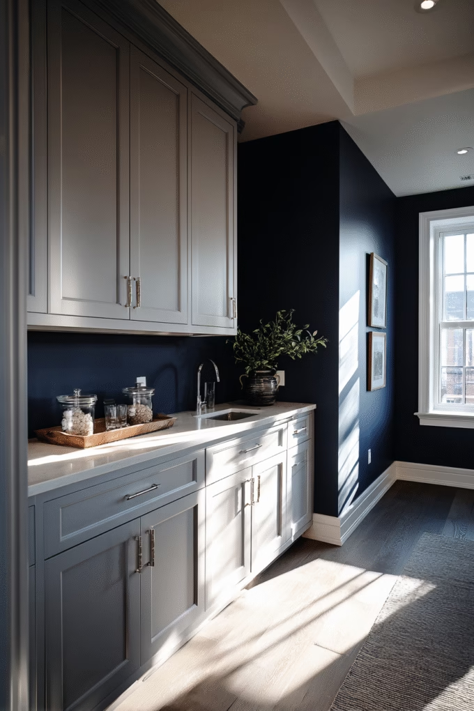
Navy blue walls create one of the most sophisticated and dramatic pairings with grey cabinets available in modern kitchen design. This combination leverages the color wheel principle of analogous harmony—navy and grey sit close together on the cool side of the spectrum, creating visual cohesion while adding rich depth.
The result is a kitchen that feels intentional, curated, and anything but boring.
This pairing works beautifully for homeowners with large kitchens or abundant natural light who want to create intimate, cozy atmospheres. Navy absorbs light, making spaces feel smaller and more enveloping—perfect for oversized kitchens that otherwise feel cavernous or impersonal. It’s particularly stunning with light to medium grey cabinets, creating rich contrast that draws the eye.
Though bold designers can pair it with dark grey for an ultra-moody, dramatic aesthetic.
According to Homes & Gardens, Benjamin Moore’s Helen Shaw notes that rich, jewel-inspired tones like “Hale Navy” (HC-154) can be married with mid-grey to enhance its glamorous characteristics and create a sophisticated, classic scheme that works for both kitchen dining and entertaining.
The key to success lies in ensuring your navy has enough depth—weak or washed-out blues will look mismatched and indecisive. Look for navy paints with LRV ratings below 10 (indicating true deep navy) like Sherwin Williams’ “Naval” (SW 6244) or Farrow & Ball’s “Hague Blue” (30).
Consider the 60-30-10 interior design rule here: grey cabinets comprise 60% of visual space, navy walls 30%, and use the remaining 10% for lighter accents through countertops, backsplash, or décor. This prevents the space from feeling too dark or overwhelming while maintaining that dramatic, sophisticated impact.
4. Soft Sage Green or Muted Green Walls
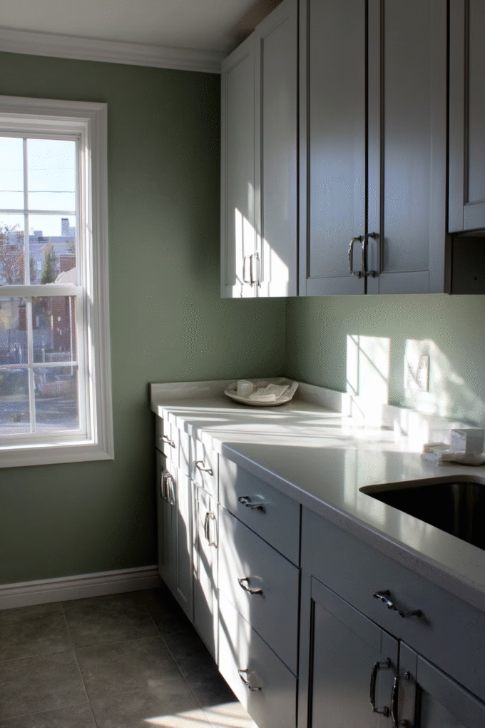
Green has emerged as the kitchen color of 2025, and for good reason—it pairs exceptionally well with grey cabinets while bringing natural, organic warmth to the space. According to the National Association of Realtors’ 2025 Kitchen Trends Report, 76% of design and remodeling professionals identify green as the most popular color to incorporate in kitchens this year.
This isn’t coincidental—green and grey create natural harmony because they’re both present in nature, evoking images of moss-covered stones or foggy forests at dawn.
This combination works for homeowners wanting to incorporate the biophilic design trend—our innate human connection to nature—without literal plant installations that require maintenance. Sage green walls with grey cabinets create an instantly calming environment that reduces stress levels by promoting positive associations with natural landscapes and outdoor spaces.
It works beautifully across all grey tones, from light to charcoal, though the mood changes depending on your specific pairing.
Light grey with sage feels fresh, spring-like, and uplifting—perfect for breakfast nooks or eat-in kitchens where you want to start your day with positive energy. Dark grey with sage delivers sophisticated, moody elegance that works beautifully for statement kitchens in open-concept homes.
According to Homes & Gardens, Farrow & Ball creative director Charlotte Cosby notes that grey happily layers with smoky greens like “Green Smoke,” which have gentle undertones of nature that complement grey’s stony qualities without competing for attention.
When selecting green paint, avoid bright or lime tones that can clash with grey’s sophistication—instead, choose muted, grey-based greens with LRV around 40-60. Excellent options include Benjamin Moore’s “October Mist” (1495) or Sherwin Williams’ “Clary Sage” (SW 6178), both of which contain enough grey pigment to create cohesion rather than stark contrast.
5. Powder Blue or Soft Blue Walls
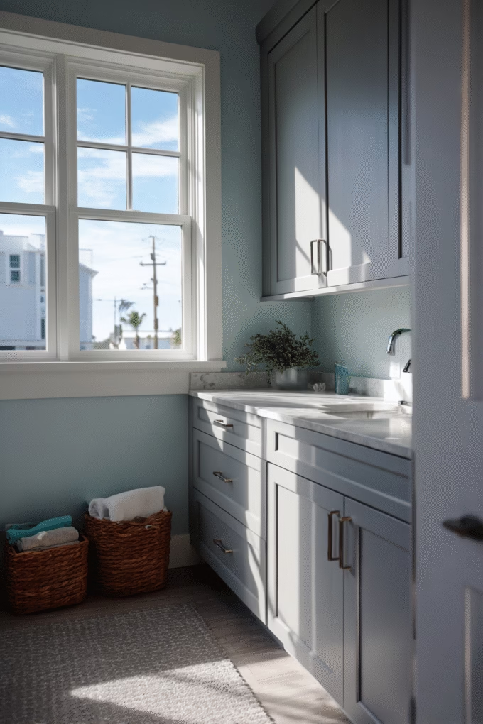
While navy delivers drama, soft powder blue walls offer a serene, spa-like quality when paired with grey cabinets. This combination works through tonal harmony—both colors share coolness, creating a calming, cohesive environment that feels intentional rather than accidental or poorly coordinated.
Powder blue contains significant white pigment, giving it an LRV typically between 60-75, which maintains brightness while adding gentle, soothing color.
This pairing is ideal for homeowners seeking a coastal, cottage, or modern farmhouse aesthetic where you want to evoke feelings of tranquility and cleanliness. It’s particularly effective in kitchens where you want to create spa-like environments—the light blue suggests water and sky, subconsciously promoting associations with relaxation and renewal.
It works best with light to medium grey cabinets; dark grey can overpower soft blues, creating imbalance and making the blue appear washed out or insignificant.
When selecting powder blue paint, ensure it has enough grey undertone to prevent it from reading as baby blue (which can feel juvenile or outdated in kitchen design). Benjamin Moore’s “Beacon Gray” (2128-60), despite its name, actually reads as a soft blue-grey and pairs beautifully with grey cabinets for a cohesive, sophisticated look.
Another excellent choice is Sherwin Williams’ “Rainwashed” (SW 6211), which has both blue and grey notes that create seamless coordination.
Design consideration: Powder blue walls work best when you incorporate warmer elements elsewhere to prevent the space from feeling too cold or sterile. Warm-toned wood flooring, brass or gold hardware, and natural wood open shelving create essential temperature balance in an otherwise cool palette, ensuring your kitchen feels welcoming rather than clinical.
6. Sunny Yellow Accent Wall
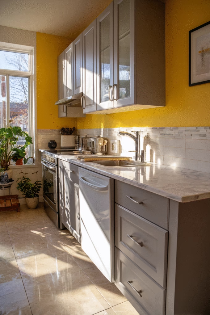
If you want to inject energy and cheerfulness into your kitchen, a sunny yellow accent wall paired with grey cabinets creates one of the most uplifting color combinations in interior design.
This works through color temperature contrast—warm yellow (which sits opposite cool grey on the temperature spectrum) creates visual excitement and energy while grey anchors the brightness, preventing it from becoming overwhelming or chaotic.
The result is a kitchen that feels happy, energetic, and welcoming.
According to Homes & Gardens, Annie Sloan, inventor of Chalk Paint, advises incorporating vibrant contrasts like “English Yellow” for an energized space, noting that trusting your instincts about color choices creates rooms that make you feel good when entering them each morning.
This pairing is ideal for homeowners with north-facing kitchens that receive cool, indirect light throughout the day—the warm yellow compensates for the lack of warm sunlight, creating artificial warmth that makes spaces feel more inviting.
It’s particularly effective in breakfast nooks or eat-in kitchens where you want to create a cheerful morning atmosphere that helps you start your day with positive energy. When selecting yellow paint, shade selection is absolutely critical for success.
Pale, buttery yellows work with light grey cabinets for a soft, cottage feel that’s gentle and inviting. Medium saturated yellows (LRV 50-70) pair beautifully with medium grey for a bold but balanced look that makes a statement without overwhelming. Reserve deep mustard yellows (LRV below 45) for dark charcoal cabinets where the moody contrast creates sophisticated drama.
Avoid neon or primary yellows which can feel juvenile or dated.
Excellent yellow options include Benjamin Moore’s “Hawthorne Yellow” (HC-4) for a warm, buttery tone, or Sherwin Williams’ “Bee” (SW 6683) for something more saturated and bold. Apply yellow as an accent wall (typically 15-25% of wall space) rather than throughout the entire kitchen—usually the wall facing your main work triangle so you see it while cooking but it doesn’t dominate your peripheral vision or overwhelm the senses.
7. Blush Pink or Dusty Rose Walls
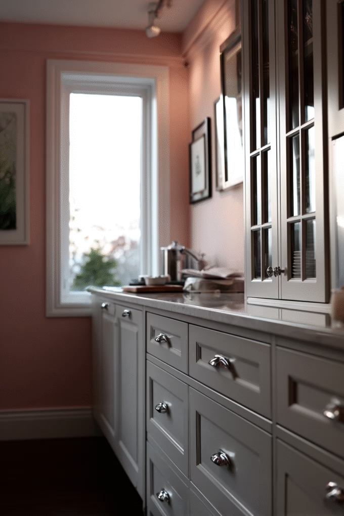
Blush pink walls might seem unconventional for a kitchen, but they create a surprisingly sophisticated pairing with grey cabinets that’s gained significant traction in high-end kitchen design over the past few years.
This combination leverages color psychology—pink’s warmth and grey’s coolness balance each other perfectly, creating spaces that feel both welcoming and refined without leaning too far in either direction.
The key lies in selecting the right pink: dusty, muted tones with grey undertones rather than bright, saturated pinks that can feel overwhelming or juvenile.
According to Homes & Gardens, Farrow & Ball notes that grey layers beautifully with rose pinks like “Sulking Room Pink,” and designer Grazzie Wilson confirms that pink and grey are a classic combination that work so well together because they balance each other out—pink warms grey without clashing against cooler undertones, creating sophisticated harmony.
This pairing is perfect for homeowners seeking a feminine yet sophisticated aesthetic, particularly in transitional or contemporary kitchens where unexpected color choices add personality and character.
It works best with light to medium grey cabinets where the contrast creates definition; dark grey can make pink appear washed out, weak, or insignificant in comparison. When implementing this combination, select pink with significant grey pigment to prevent it from reading as “little girl’s room” or overly sweet.
Benjamin Moore’s “Paisley Pink” (1261) or Sherwin Williams’ “Rosebud” (SW 6288) both contain enough grey to pair cohesively with grey cabinets without clashing. These have LRV ratings around 55-65, maintaining sufficient brightness while delivering sophisticated color.
Balance pink walls with cooler-toned elements elsewhere in the kitchen. Marble or white quartz countertops, chrome or brushed nickel hardware, and touches of black create necessary temperature contrast that prevents the space from feeling overly warm, saccharine, or one-dimensional in its color story.
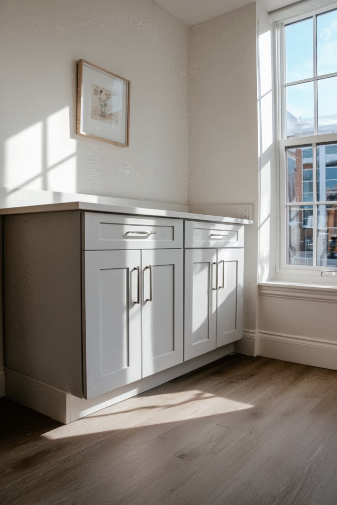
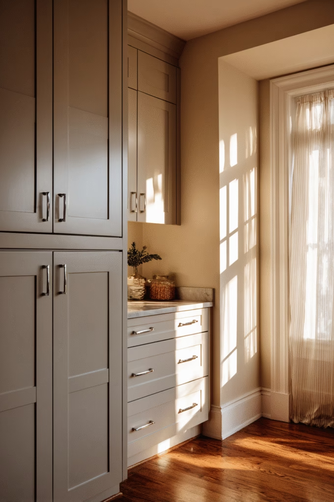
8. Warm Greige (Grey-Beige) Walls
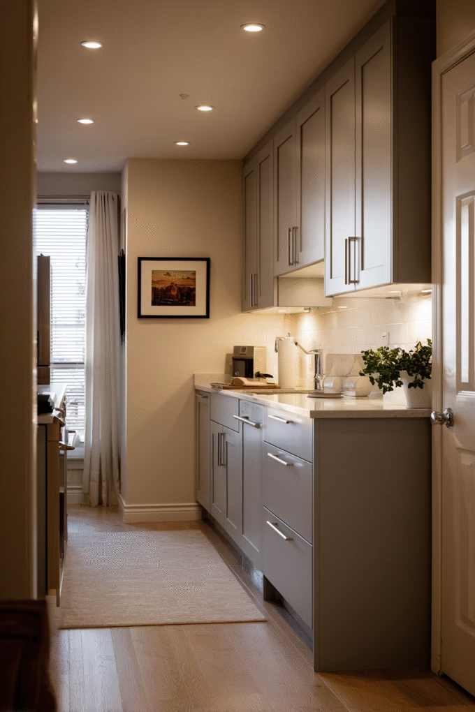
For those who love grey but want to avoid any risk of coldness or sterility, greige walls—a perfect blend of grey and beige—create seamless harmony with grey cabinets. This works because both colors share pigments, creating a monochromatic scheme with subtle tonal variation that feels cohesive and intentional.
The slight beige addition brings warmth without introducing distinct color, making spaces feel cozy while maintaining the neutrality and sophistication that grey provides.
This combination is ideal for homeowners pursuing a warm minimalist or Japandi aesthetic where subtle, natural tones create calm sophistication and zen-like environments. It’s particularly effective in open-concept homes where kitchen walls flow into living spaces—greige transitions beautifully between rooms without jarring color shifts that can make spaces feel choppy or disconnected.
It works with any shade of grey cabinets, though matching the temperature (cool greige with cool grey, warm greige with warm grey) creates the most cohesive, polished result.
When selecting greige paint, understand that undertones vary significantly between brands and even between different greige colors from the same manufacturer. Some lean heavily beige (reading almost tan in certain lighting), while others are predominantly grey (reading almost taupe).
For true greige that balances both colors equally, look for LRV ratings between 55-65 that maintain brightness without washing out.
Excellent options include Sherwin Williams’ “Agreeable Gray” (SW 7029), which despite its name is actually greige and one of their best-selling colors, or Benjamin Moore’s “Revere Pewter” (HC-172), a famous greige that’s been a top seller for over a decade and works beautifully in countless applications. Because greige and grey cabinets are so similar in value and tone, ensure sufficient contrast through finish—if cabinets are matte, use eggshell or satin on walls.
This creates textural distinction that prevents the space from appearing flat, monotonous, or lacking dimension.
9. White Quartz or Marble Countertops
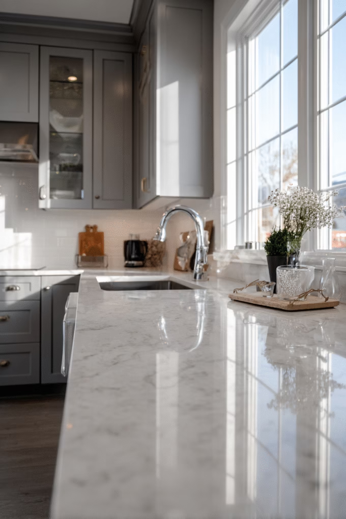
Moving beyond wall colors, countertop selection dramatically impacts how your grey cabinets present in the overall kitchen design. White quartz or marble countertops create the most popular and timeless pairing with grey cabinets, working through value contrast—the light horizontal surfaces balance grey’s vertical presence, creating visual equilibrium that the human eye finds naturally pleasing.
This combination has dominated kitchen design for over a decade for good reason: it’s crisp, clean, and works seamlessly across all design styles from traditional to ultra-modern.
This pairing is perfect for homeowners wanting a kitchen that appeals to future buyers—real estate data consistently shows that grey cabinets with white countertops are among the most universally appealing combinations, potentially adding value during resale by signaling quality and current design awareness. It’s particularly effective in small kitchens where the white countertops reflect light upward, brightening the entire space and making it feel more open and airy.
It works with any shade of grey cabinet, though the aesthetic differs significantly—light grey with white quartz reads as airy and Scandinavian, while charcoal grey with white marble delivers dramatic luxury and high-end sophistication.
When selecting white quartz, consider veining carefully as it significantly impacts the final aesthetic. Minimal veining (like Caesarstone’s “Pure White” or Cambria’s “Torquay”) creates modern simplicity that works in contemporary kitchens. Quartz with grey veining (like “Calacatta Laza” or “Statuario Nuvo”) echoes your cabinet color for enhanced cohesion and coordination.
For marble, consider maintenance requirements seriously—Carrara marble, while beautiful with grey cabinets, requires sealing every 6-12 months and etches easily from acidic foods like lemon juice or tomato sauce.
Many homeowners now choose marble-look quartz for the aesthetic without the intensive upkeep, and modern quartz replicates marble so accurately that most people can’t distinguish the difference from normal viewing distance. Ensure your white countertop has an LRV of at least 75 (preferably 80+) to achieve the maximum brightening effect in your kitchen space.
10. Warm Wood or Butcher Block Countertops
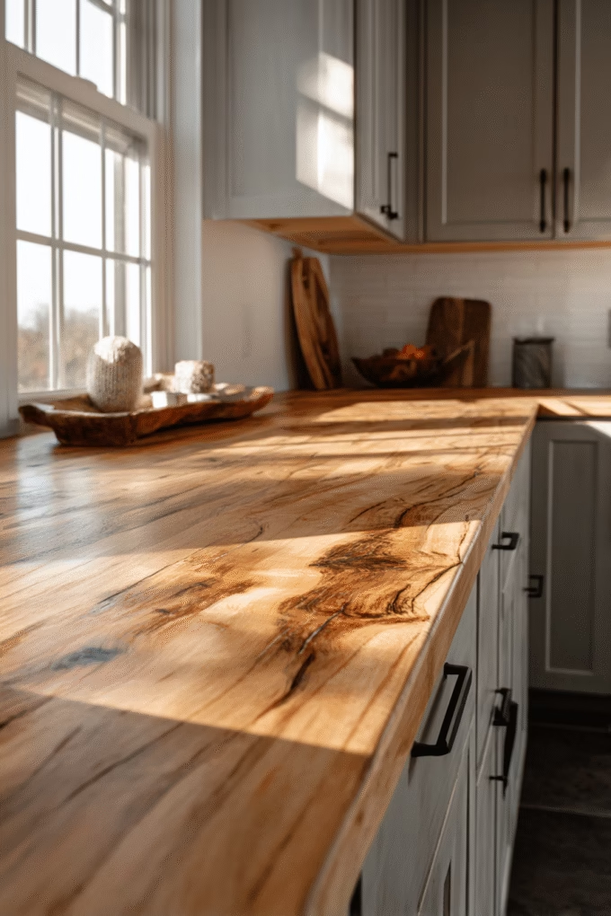
For those wanting to introduce warmth without adding color, butcher block or warm wood countertops create beautiful contrast with grey cabinets through material and temperature differences.
Wood brings organic warmth that prevents grey from feeling cold, industrial, or sterile, while the natural grain adds textural interest that makes kitchens feel more lived-in, approachable, and welcoming.
This combination works particularly well in farmhouse, transitional, or Scandinavian-inspired kitchens where natural materials are celebrated.
This pairing is ideal for avid home cooks who value function over just aesthetics—butcher block provides an excellent cutting surface that improves with age, developing a rich patina that adds character and tells the story of meals prepared and memories made.
It’s also perfect for homeowners concerned about sustainability, as wood is renewable and biodegradable unlike synthetic countertop materials that end up in landfills.
Wood countertops work best with light to medium grey cabinets; dark grey can sometimes overpower lighter woods, though this can be intentional for dramatic contrast in larger kitchens.
When selecting wood, consider undertone temperature matching for the most cohesive results. Grey cabinets with cool (blue) undertones pair best with cool-toned woods like maple or birch that have minimal yellow or red pigment. Grey with warm (beige/taupe) undertones complement warm woods like cherry, walnut, or oak that have richer, warmer coloring.
Avoid reddish woods like mahogany with cool greys—the temperature clash creates discord rather than harmony.
Maintenance consideration: Butcher block requires regular oiling (typically monthly for the first year, then every 3-6 months) to maintain moisture and prevent cracking, warping, or splitting. Many homeowners install butcher block on an island or a section of countertop rather than throughout the entire kitchen, pairing it with quartz or solid surface elsewhere for lower-maintenance work surfaces near sinks or high-traffic areas.
11. Brass or Gold Hardware
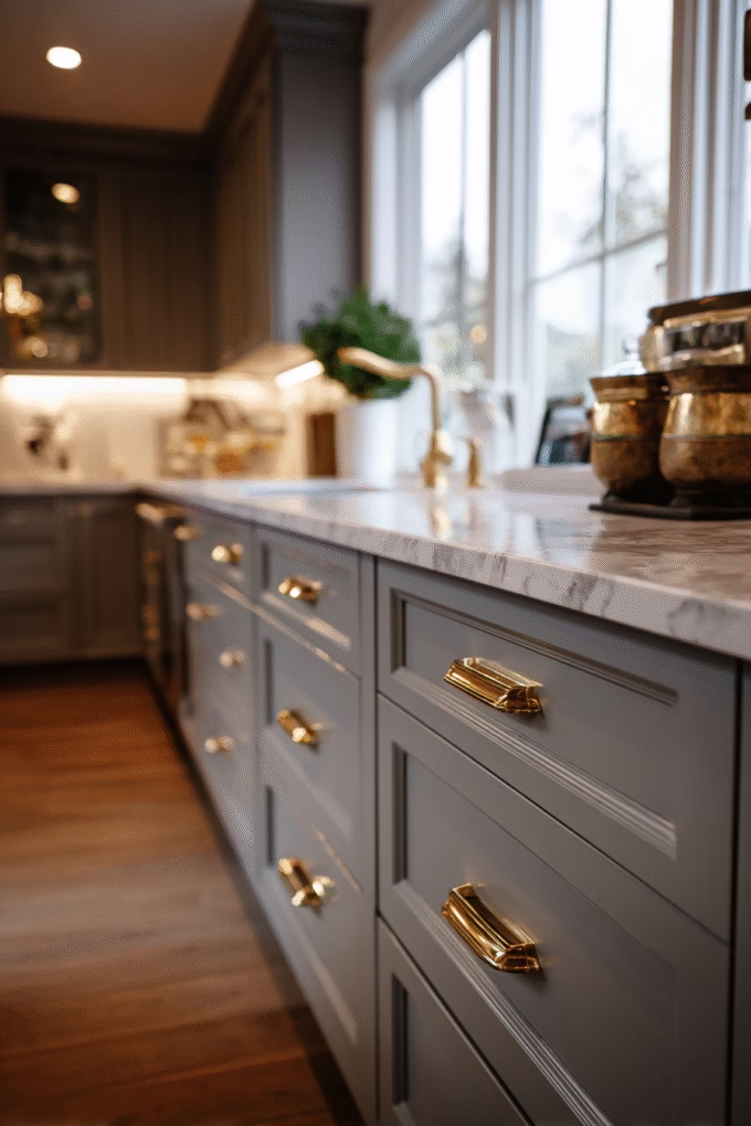
Hardware selection dramatically impacts how grey cabinets present in your kitchen, and brass or gold finishes have emerged as the premier choice for adding warmth and luxury to grey cabinetry. This works through temperature contrast—warm metallic tones prevent cool grey from feeling sterile, cold, or unwelcoming.
Brass also benefits from the design principle of repetition—when you repeat brass throughout your kitchen (faucet, light fixtures, cabinet pulls), you create intentional cohesion rather than random, chaotic metallic mixing.
This combination is ideal for homeowners pursuing traditional, transitional, or modern glam aesthetics where a touch of luxury elevates the space from ordinary to extraordinary.
It’s particularly effective with light to medium grey cabinets—the warm brass “pops” against the neutral background, creating jewelry-like accents throughout your kitchen that draw the eye. With dark grey or charcoal cabinets, brass still works beautifully but delivers a more subtle, sophisticated effect rather than bold, high-contrast impact.
When selecting brass hardware, understand the finish variations available: unlacquered brass develops a natural patina over time (creating an aged, antique look that some homeowners love), while lacquered brass maintains its bright, polished appearance indefinitely with minimal maintenance. Living brass (unlacquered) works beautifully in farmhouse or traditional kitchens where aged character adds charm.
Polished brass suits contemporary or glam designs where shine and glamour are desired. For something between these extremes, brushed brass or satin brass offers warmth without excessive shine, working across multiple design styles.
Proportion matters significantly: For shaker or traditional cabinets, larger cup pulls (3-5 inches) or substantial knobs (1.25-1.5 inch diameter) provide appropriate scale that doesn’t get lost on the cabinet doors. For modern flat-panel or slab cabinets, sleek bar pulls (6-12 inches) or minimal knobs create the clean lines that suit contemporary design aesthetics.
Always purchase samples to test scale and finish in your actual kitchen before buying enough hardware for your entire space—what looks perfect in the store or online may feel wrong in your specific application.
12. Matte Black Hardware
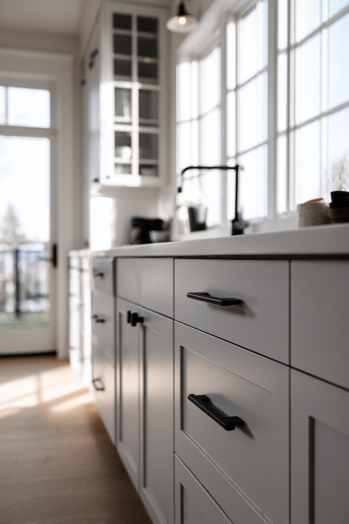
On the opposite end of the spectrum, matte black hardware creates bold, contemporary contrast with grey cabinets that’s dominated modern kitchen design over the past several years. This works through value contrast—the deep black against grey creates definition and architectural interest, making each cabinet door and drawer read as a distinct design element rather than blending together.
Matte black also benefits from being both currently trendy and historically rooted (black hardware has been used for centuries), making it feel both contemporary and timeless.
This pairing is perfect for homeowners pursuing modern, industrial, or minimalist aesthetics where clean lines and graphic contrast create visual impact and drama. It works exceptionally well with light grey cabinets where the black hardware provides maximum contrast and makes the strongest statement.
Though it’s equally striking with medium grey for a more tonal, sophisticated approach. With dark grey or charcoal cabinets, black hardware becomes more subtle, creating a monochromatic, ultra-modern effect that emphasizes form over contrast.
When implementing black hardware, finish selection matters significantly for both aesthetics and maintenance. Matte black (no shine) creates soft, modern aesthetics that don’t compete with other finishes in the kitchen. Satin black (slight sheen) offers subtle sophistication that’s easier to keep clean than completely matte finishes which can show fingerprints.
Avoid oil-rubbed bronze with grey cabinets unless they have significant warm undertones—the finish often appears too brown and dated against cool greys, creating visual discord.
Style consideration: Black hardware reads more casual and contemporary than brass or chrome, so ensure it aligns with your overall kitchen style and the rest of your home. In traditional or transitional kitchens, black can feel jarring unless you repeat black elsewhere (black window frames, black light fixtures, black faucet) to create intentional cohesion rather than a single out-of-place element that looks like an afterthought.
13. White Subway Tile Backsplash
White subway tile remains the most popular backsplash choice for grey cabinets, and for excellent reason—this combination creates timeless, classic kitchens that appeal universally across demographics and design preferences.
The pairing works through both value contrast (light tile against grey cabinets) and the design principle of simplicity—the clean horizontal lines of subway tile echo traditional design while maintaining contemporary freshness that prevents the look from ever feeling dated.
White reflects light, brightening workspaces and making the kitchen feel larger and more open.
This pairing is ideal for homeowners wanting a kitchen that won’t feel dated in 5-10 years—an important consideration given the cost and disruption of kitchen renovations. White subway tile has been a design constant since the early 1900s and shows absolutely no signs of waning in popularity.
It works beautifully with any shade of grey cabinet and across all design styles by simply changing the installation pattern to match your aesthetic.
Use traditional running bond (brick pattern) for classic kitchens, herringbone or vertical stack for contemporary spaces, or larger-format subway tiles (4×12 inches instead of 3×6) for more modern aesthetics that feel current. When implementing subway tile with grey cabinets, grout color dramatically impacts the final look and maintenance requirements.
White grout creates a seamless, cohesive appearance but shows dirt, stains, and discoloration readily in kitchens where splatter and moisture are constant. Light grey grout (matching your cabinets’ undertone) provides subtle definition while hiding staining better—this is interior designers’ preferred choice for most installations.
Dark grey or black grout creates bold contrast and pattern, working particularly well in modern or industrial-style kitchens with light grey cabinets.
Installation tip: For timeless appeal that won’t date your kitchen, install subway tile in traditional running bond (brick) pattern with 1/3 offset. For contemporary flair, try vertical stack (aligned vertically in columns) or herringbone which adds movement and visual interest. Keep grout lines consistent at 1/16 to 1/8 inch for professional results—lines wider than 1/8 inch can appear sloppy and collect significantly more dirt and grime over time.
14. Marble Slab Backsplash
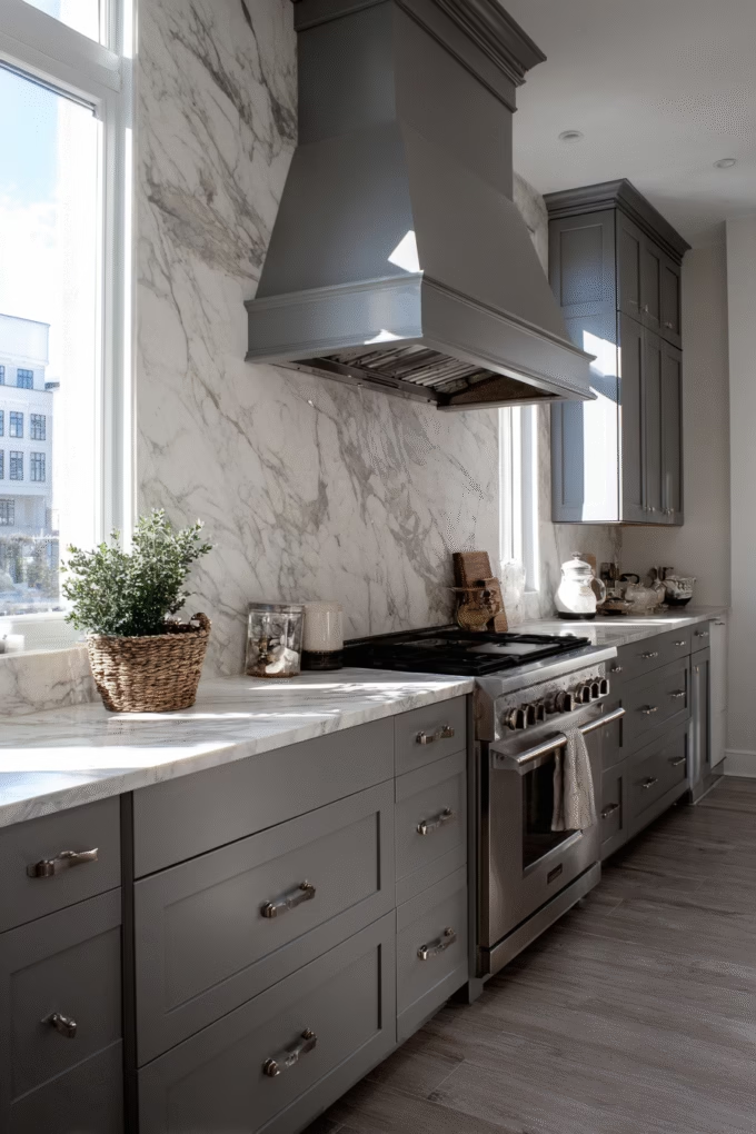
For homeowners seeking luxury and making a design statement, a marble slab backsplash paired with grey cabinets creates one of the most sophisticated combinations available in high-end kitchen design.
Unlike individual tiles, full-height marble slabs (from countertop to upper cabinets or ceiling) create dramatic, uninterrupted veining that serves as functional art and a stunning focal point.
This works through the design principle of focal point creation—the marble draws the eye immediately and becomes the kitchen’s statement piece while grey cabinets provide a refined, neutral frame that doesn’t compete for attention.
This combination appears frequently in designer kitchens featured in luxury home magazines, with marble’s natural veining and elegant appearance complementing the understated elegance of grey cabinets perfectly. It’s ideal for homeowners with larger budgets pursuing traditional, transitional, or luxe modern aesthetics where material quality signals refined taste.
The investment pays dividends in resale value—marble signals premium construction and design quality to potential buyers. It works best with light to medium grey cabinets where marble’s natural grey veining echoes the cabinet color for enhanced cohesion and coordination.
When selecting marble, Carrara offers classic white with soft grey veining and is the most affordable marble option at $50-100 per square foot installed. Calacatta provides bolder, more dramatic veining with warmer undertones and costs $100-200 per square foot for materials and installation. Statuary marble delivers pure white with striking dark veining and runs $200-400+ per square foot depending on quality and availability.
All three pair beautifully with grey cabinets, though Carrara’s subtle grey tones create the most harmonious coordination.
Maintenance reality check: Marble is porous and susceptible to etching from acidic foods (lemon juice, tomato sauce, wine) which can dull the surface. For backsplashes, this matters less than countertops since direct contact with acidic substances is minimal during normal use.
However, seal marble backsplashes annually with quality stone sealer and clean only with pH-neutral cleaners designed for natural stone. Many homeowners choose Carrara marble-look porcelain slabs for the aesthetic without the maintenance requirements—modern porcelain replicates marble veining so accurately that most people can’t distinguish the difference from six feet away.
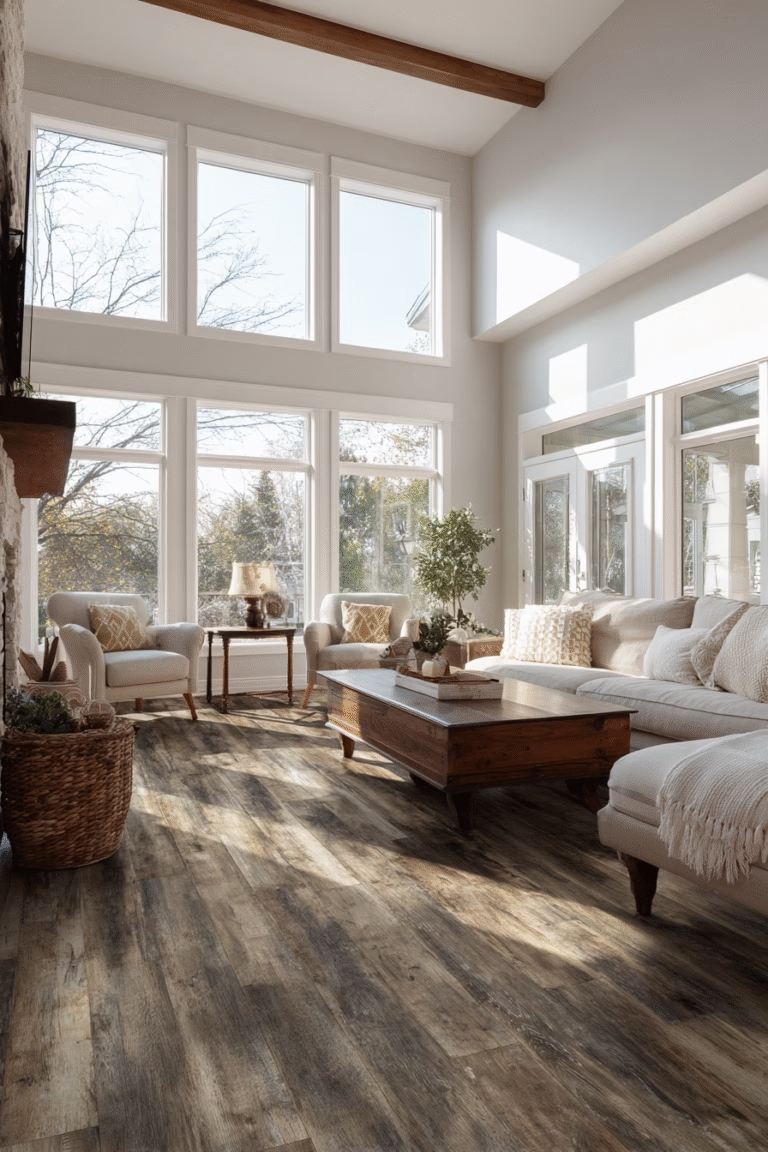
15. Light Wood or Whitewashed Flooring
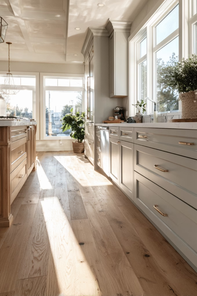
Flooring dramatically impacts how grey cabinets present in the overall kitchen design, and light wood or whitewashed floors create an airy, Scandinavian-inspired aesthetic that’s both timeless and perfectly on-trend.
This works through value coordination—light flooring, light to medium grey cabinets, and light walls create continuous flow that makes spaces appear significantly larger and more cohesive.
The warm undertone in wood prevents the grey from feeling cold or unwelcoming while maintaining overall brightness and openness.
This combination is ideal for small kitchens or those with limited natural light where dark flooring would absorb too much light and make the space feel cramped, closed-in, or oppressive. It’s perfect for homeowners pursuing Scandinavian, coastal, modern farmhouse, or transitional aesthetics where natural materials and light tones create calm, welcoming environments.
Light floors work particularly well with light to medium grey cabinets, creating seamless flow and continuity. With dark grey cabinets, the high contrast creates a more contemporary, graphic effect rather than flowing continuity—still beautiful but with a different aesthetic impact.
When selecting light wood flooring, choose species and finishes based on durability needs and aesthetic goals that align with your lifestyle. White oak with a natural or light stain offers excellent durability (Janka hardness rating around 1360) perfect for high-traffic kitchens while providing classic, warm tones.
Maple flooring (Janka hardness 1450) delivers even lighter, cooler tones that suit modern aesthetics beautifully. For maximum lightness, consider whitewashed or white-stained oak, though note that very light floors show dirt, dust, and wear more readily than medium tones—important for families with children or pets.
Engineered vs. solid consideration: In kitchens specifically, engineered hardwood often performs better than solid wood due to temperature and humidity fluctuations near appliances and water sources. Engineered wood’s layered construction prevents warping and cupping that can occur with solid wood near sinks, dishwashers, or refrigerators where moisture is present.
16. Dark Wood or Espresso Flooring
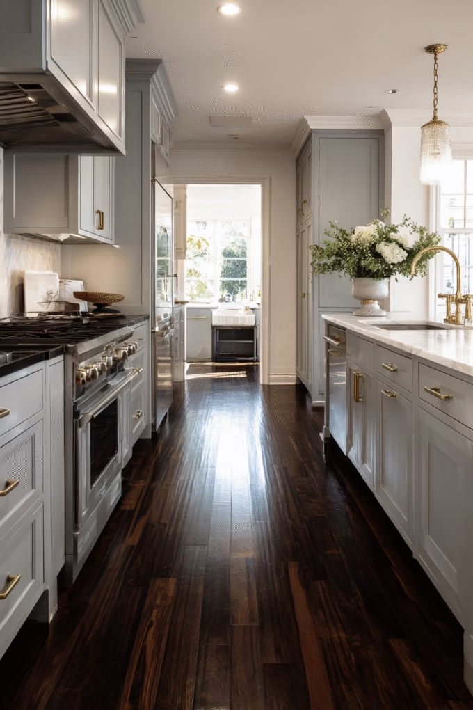
On the opposite end, dark wood or espresso flooring creates dramatic, grounding contrast with grey cabinets that anchors the design and adds sophisticated depth. This works through the design principle of visual weight distribution—dark floors anchor the bottom of the room while grey cabinets occupy the mid-level, creating balanced composition that the eye finds pleasing.
Dark floors also offer significant practical benefits, hiding dirt, scratches, pet hair, and daily wear far better than light floors in high-traffic kitchens.
This combination is ideal for homeowners with large kitchens or abundant natural light who want to create intimate, sophisticated atmospheres that feel cozy rather than cavernous. It works beautifully in traditional, transitional, or modern kitchens by simply adjusting the wood species and finish to match your overall style.
Dark floors pair particularly well with light to medium grey cabinets where the contrast creates clear definition and visual interest. With dark grey cabinets, the tonal approach creates ultra-modern, moody aesthetics that feel dramatic and intentional.
When selecting dark flooring, consider whether you want cool or warm dark tones as this significantly impacts coordination. Ebony-stained oak or walnut provides cool, true dark brown that coordinates beautifully with cool grey cabinets that have blue undertones. Espresso or dark cherry offers warmer, reddish undertones that suit warm grey or greige cabinets better.
For truly contemporary looks, consider grey-stained or weathered grey wood flooring that creates tonal coordination rather than brown contrast—this creates sophisticated monochromatic schemes.
Design balance: With dark floors and grey cabinets, your countertops and backsplash become critical elements for preventing the space from feeling too heavy, dark, or cave-like. Choose light countertops (white quartz, light marble, or light solid surface) and light backsplashes to create horizontal light bands that relieve visual weight and maintain brightness.
Ensure excellent lighting throughout—aim for 50-100 lumens per square foot in kitchens with dark floors and cabinets, using layered lighting (ambient, task, and accent) for best results.
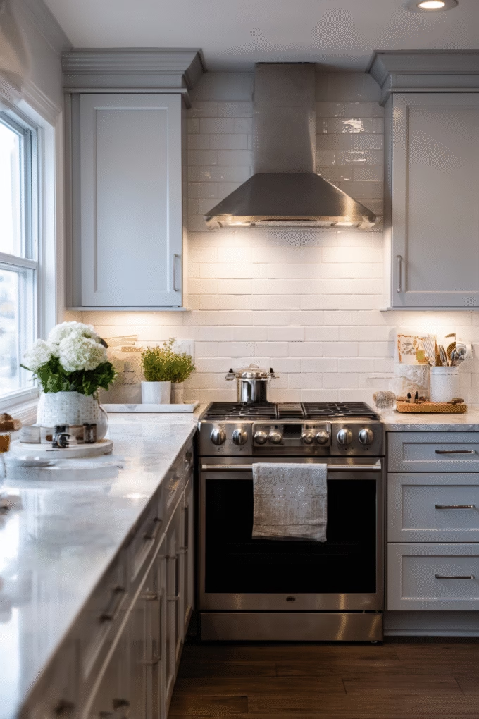
17. Stainless Steel Appliances
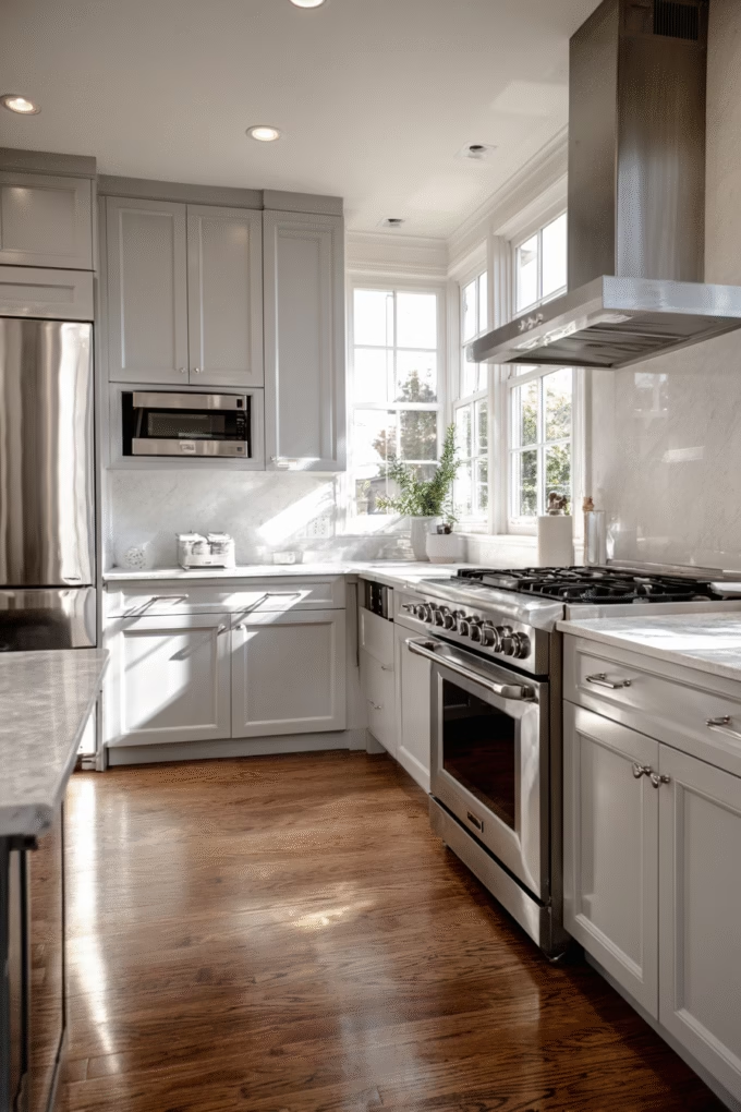
While not technically a “color” choice, stainless steel appliances create the most popular and practical pairing with grey cabinets in contemporary kitchen design. Stainless steel’s cool metallic tone harmonizes with grey’s inherent neutral coolness, creating cohesive, professional-looking kitchens that signal quality and functionality.
This combination has dominated kitchen design for over two decades because it works universally—stainless complements every shade of grey from pale silver-grey to deep charcoal without clashing or looking mismatched.
This pairing is ideal for anyone pursuing modern, contemporary, transitional, or even farmhouse aesthetics (where stainless provides contemporary balance to rustic wood elements). Professional-style ranges, refrigerators, and dishwashers in stainless steel signal quality, durability, and serious cooking capabilities.
The finish is also practical—true stainless steel resists fingerprints better than many people expect, and many manufacturers now offer “smudge-proof” or “fingerprint-resistant” stainless finishes that make maintenance even easier for busy families.
When coordinating stainless appliances with grey cabinets, consider hardware coordination for the most polished look. Stainless steel appliances pair seamlessly with chrome or brushed nickel cabinet hardware since all share cool metallic tones and similar visual weight.
They can also coordinate with brass or gold hardware in transitional or mixed-metal kitchens, though ensure the brass is substantial enough not to be overwhelmed by the stainless appliances’ visual presence.
Alternative consideration: Black stainless steel appliances (a dark charcoal finish) have emerged as a popular alternative to traditional stainless, particularly stunning with grey cabinets for creating tonal, sophisticated aesthetics that feel coordinated and intentional. Matte black appliances also pair beautifully with grey cabinets in ultra-modern kitchens where graphic contrast creates impact.
Panel-ready appliances (which accept custom cabinet panels) can be covered in the same grey as your cabinets for seamless, built-in looks favored in high-end, custom kitchens where appliances virtually disappear.
18. Black or Charcoal Grey Island
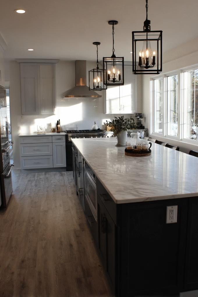
For those wanting visual interest without painting multiple wall colors, a black or charcoal grey island paired with lighter grey perimeter cabinets creates stunning focal points that ground kitchen designs beautifully.
This works through the design principle of emphasis—the darker island draws the eye immediately and anchors the center of the room while lighter perimeter cabinets maintain airiness and prevent the space from feeling too heavy or dark.
Two-tone cabinetry has become increasingly popular in 2025 trends, with designers and homeowners noting that painted uppers paired with darker lowers help define zones and ground the space.
This combination is ideal for homeowners with open-concept kitchens where the island serves as both functional workspace and visual divider between kitchen and adjacent living or dining areas. It’s particularly effective in large kitchens (200+ square feet) where a single cabinet color can feel monotonous or lack visual interest—the contrasting island adds variety, depth, and a clear focal point.
It works best with light grey perimeter cabinets (creating maximum contrast and impact) though medium grey perimeter with charcoal islands also delivers sophisticated tonal variation.
When implementing two-tone cabinetry, consider proportion and balance carefully for the most professional results. The island typically comprises 15-30% of total cabinet square footage—sufficient to make a statement without overwhelming the design or making the space feel unbalanced.
Ensure the two grey tones share undertones (both cool or both warm) for cohesion rather than clashing or appearing mismatched. For maximum impact and intentionality, consider extending the dark color to a built-in pantry or floor-to-ceiling cabinet wall, creating deliberate “zones” of dark and light rather than the island being the sole dark element floating in a sea of light cabinets.
Hardware consideration: Two-tone cabinets allow for creative hardware mixing if desired, giving you flexibility to express your style. You might use brass hardware on the dark island for warmth and luxury while using chrome on light perimeter cabinets for cohesion with stainless appliances.
Alternatively, use matching hardware throughout for clean, unified aesthetics—matte black looks particularly striking when used consistently throughout a two-tone kitchen, creating cohesion across the color variation.
Conclusion
Grey kitchen cabinets offer remarkable versatility, pairing beautifully with everything from crisp whites and warm creams to bold navy blues, sophisticated forest greens, and even unexpected blush pinks.
The key to successful color coordination lies in understanding your specific grey’s undertones—whether cool blue-grey, warm greige, or true neutral grey—and selecting complementary colors that either harmonize tonally for cohesion or contrast intentionally for visual interest and impact.
Despite occasional concerns about grey feeling overused or dated, the National Kitchen & Bath Association’s 2025 data confirms grey remains a top cabinet choice, valued for its remarkable flexibility to adapt to various design styles while maintaining timeless sophistication that transcends passing trends.
By thoughtfully selecting wall colors, countertops, backsplash, hardware, and flooring that coordinate with your grey cabinets, you’ll create a kitchen that feels both current and enduring—one that you’ll love for years to come and that will appeal to future buyers if you eventually sell.
Remember that successful kitchen design extends beyond simply matching colors mechanically. Consider how natural light interacts with your choices throughout the day, sample colors in your actual space before committing to full-scale application, and don’t be afraid to incorporate personal touches through accent colors and carefully chosen accessories.
Whether you’ve chosen soft sage walls with brass hardware or dramatic navy walls with marble countertops, the combinations explored in this guide provide designer-approved starting points for creating your perfect grey kitchen that reflects your personal style and meets your functional needs.
Ready to transform your grey kitchen? Start by identifying your grey’s undertone using natural daylight at different times of day—this is the critical foundation for all other decisions. Then select your top three color pairings from this guide based on your design style, lighting conditions, and personal preferences.
Visit a paint store to collect large samples (at least 12×12 inches, preferably larger) and test them in your actual space for 3-5 days minimum, observing how they look during different times of day and under both natural and artificial lighting conditions.
This investment of time prevents costly mistakes and ensures your final color choices create the beautiful, cohesive kitchen you’ve envisioned.
Pin this guide for your kitchen renovation planning, and explore related articles on choosing the perfect countertop materials, understanding kitchen color psychology, hardware trends for 2025, and creating effective kitchen lighting plans that make your colors shine!