20 Stunning Wallpaper Designs for Living Rooms in 2026
This site contains affiliate links. As an Amazon Associate, I earn from qualifying purchases. The content on this website was created with the help of AI. Please read our Editorial Policy for more information.
Your living room deserves more than just a fresh coat of paint. If you’re searching for wallpaper design in living room spaces that will transform your main gathering area into something truly special, you’ve come to the right place.
Wallpaper has experienced a remarkable renaissance in 2025. According to Houzz’s Fall 2025 Design Trends Report, “Wallpaper has had several revivals in recent years — now it’s booming again,” with the trend extending beyond walls to ceiling wallpaper and architectural details. This resurgence reflects homeowners’ growing desire for personalized, character-rich spaces over the stark white walls that dominated the past decade – and we are absolutely certain there is no slowdown with this trend for 2026.
Your living room is where life happens—family movie nights, morning coffee, entertaining guests, and those rare quiet moments with a good book. It’s the room that sets the tone for your entire home, which makes choosing the right wallpaper design both exciting and slightly intimidating.
But here’s the thing: modern wallpaper isn’t your grandmother’s fussy floral that required professional installation and permanent commitment. Today’s options include peel-and-stick removable designs, durable vinyl that withstands high-traffic areas, and luxurious textured wallcoverings that add depth without overwhelming your space.
In this guide, I’ll walk you through 20 stunning wallpaper designs organized by aesthetic style—from serene botanical prints to bold geometric patterns—so you can find the perfect match for your living room personality. Each design includes shopping links to reputable sources, expert insights on why these styles work, and practical tips for making them shine in your specific space.
20 Stunning Wallpaper Designs for Living Rooms in 2026
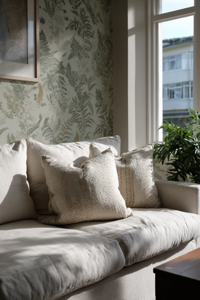
1. Oversized Botanical Mural for Biophilic Living
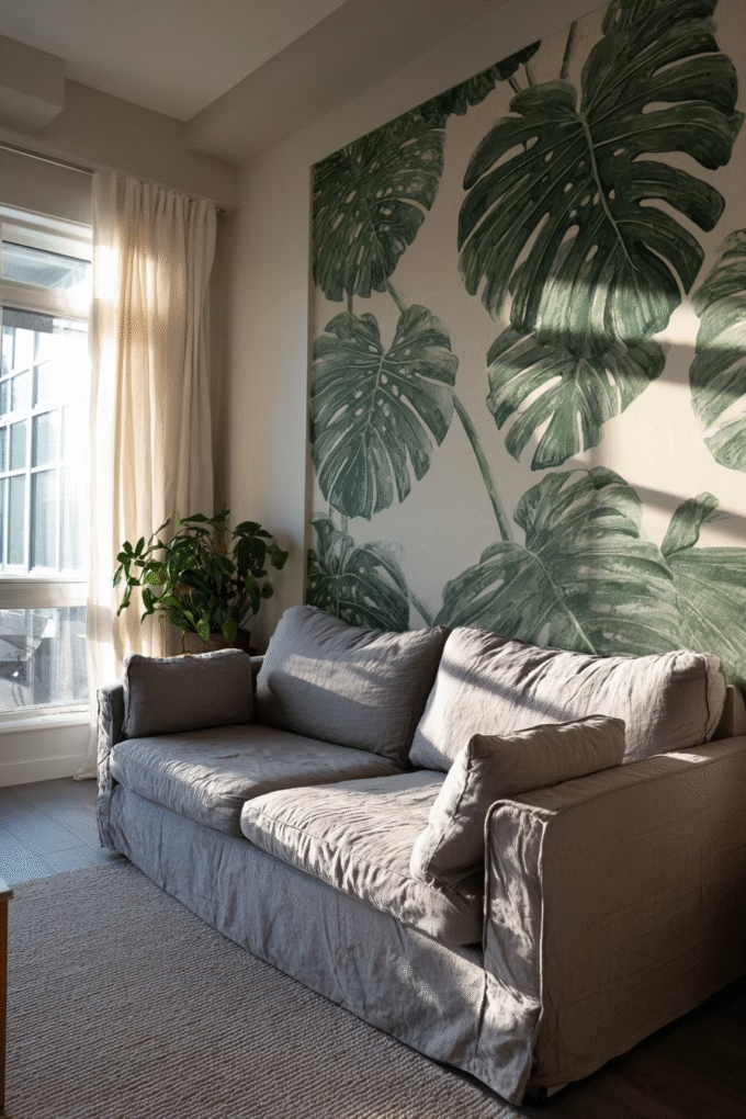
Botanical wallpaper murals featuring oversized leaves, ferns, or tropical plants create an instant connection to nature—a design principle known as biophilic design that research shows reduces stress and improves wellbeing.
This design trend continues to dominate in 2025 because it addresses our collective desire to bring the outdoors inside, particularly as more people work from home and spend extended time in their living spaces. The key to making botanical murals work is scale: oversized prints create drama without feeling busy, while smaller repeating patterns can sometimes read as overwhelming.
Choose deep emerald greens on a cream or white background for a fresh, spa-like atmosphere that works beautifully in living rooms with abundant natural light. The large-scale pattern draws the eye upward, making standard 8-foot ceilings feel taller. Interior designers recommend placing botanical murals on the wall behind your sofa or as a statement wall opposite your main seating area, where they can serve as living artwork.
For living rooms with limited square footage (under 200 square feet), stick to murals with breathing room between elements rather than dense jungle prints. In larger spaces (300+ square feet), you can embrace fuller coverage with layered foliage.
According to textile designer Clarissa Hulse, as shared in House Beautiful’s 2025 wallpaper trends article, “botanical wall murals offer a refreshing connection to the great outdoors, making rooms feel more uplifting” when properly scaled to the space. The versatility of these designs allows them to complement both modern minimalist interiors and more traditional, eclectic spaces.
Shop This Design: Sandberg Wallpaper – Living Room Collection features authentic Swedish botanical designs, or explore Rebel Walls’ Living Room Wallpaper for oversized tropical murals.
2. Classic Grasscloth Texture for Sophisticated Warmth
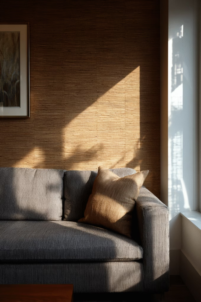
Grasscloth wallpaper brings natural texture and warmth to living rooms through woven plant fibers like jute, reed, or bamboo that create subtle horizontal or vertical lines.
This material has remained consistently popular for decades because it transcends specific design trends—working equally well in coastal, modern farmhouse, traditional, or contemporary spaces. According to Jeffrey Bershad, CEO of Phillip Jeffries (one of the leading natural wallcovering manufacturers), as quoted in Veranda’s 2025 wallpaper trends article, “bringing nature into your home is a trend that has become timeless,” noting that grasscloth is referred to as raffia in European markets but serves the same purpose of adding organic texture.
The beauty of grasscloth lies in its subtlety. Unlike patterned wallpapers that demand attention, grasscloth provides sophisticated texture that reads almost as a neutral, allowing your furniture, artwork, and accessories to take center stage. The natural variations in color and weave mean no two installations look identical, giving your living room a custom, high-end appearance.
Grasscloth works particularly well in living rooms where you want visual interest without bold pattern. It’s ideal for creating a cozy, enveloping feel when applied to all four walls, or for adding warmth to a single accent wall behind built-in shelving or a fireplace.
Choose warm beige, taupe, or wheat tones for a traditional cozy feel, or opt for gray or charcoal grasscloth in contemporary spaces. Interior designers recommend grasscloth for living rooms with existing pattern in furniture or rugs, since the textured wallcovering adds depth without competing visually.
Shop This Design: Phillip Jeffries Grasscloth Collection offers premium options in dozens of colors, or try York Wallcoverings Natural Elements for more budget-friendly alternatives.
3. Bold Geometric Patterns for Modern Edge
Geometric wallpaper featuring clean lines, abstract shapes, or repeating patterns adds contemporary sophistication and visual energy to living rooms.
This design category has remained popular since the mid-century modern revival and continues to dominate 2025 trends because geometric patterns create structure and movement simultaneously. The human eye is naturally drawn to symmetry and pattern, making geometric wallpaper an effective focal point that guides visual flow through your living room.
Geometric patterns work on the principle of repetition and scale. Large-scale geometric designs (patterns that repeat every 24+ inches) create bold, artistic statements perfect for spacious living rooms (300+ square feet) with high ceilings. Smaller-scale geometric patterns (repeats every 6-12 inches) work better in compact spaces, adding interest without overwhelming.
Choose hexagons, chevrons, or abstract angular patterns in a two-color scheme for maximum impact. Interior designers recommend contrasting colors—such as navy and gold, black and white, or emerald and cream—rather than tone-on-tone, which can read as bland from a distance.
Geometric wallpaper pairs beautifully with mid-century modern furniture featuring clean lines and tapered legs. It also complements contemporary spaces with streamlined silhouettes.
For living rooms serving multiple purposes (entertaining and relaxing), place geometric wallpaper on one accent wall to create visual interest without overstimulation. The structured pattern provides a sophisticated backdrop for displaying artwork or creating a gallery wall.
Shop This Design: Milton & King Wallpaper features bold, contemporary patterns, or explore Graham & Brown’s Living Room Collection for classic geometric designs.
4. Moody Dark Florals for Dramatic Elegance
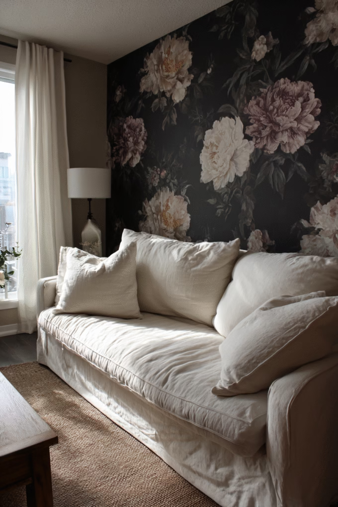
Dark floral wallpaper featuring rich, saturated background colors (charcoal, navy, forest green, or black) with contrasting botanical motifs creates an intimate, sophisticated atmosphere.
This design represents a modern twist on traditional floral wallpapers, appealing to homeowners who want pattern and personality without the cottage-style sweetness of pastel florals. According to Walls Republic’s 2025 wallpaper trends analysis, moody designs featuring deep hues like emerald green, navy blue, and charcoal gray are among the greatest trends, adding depth and sophistication especially in living rooms with luxurious dark patterns.
The psychology behind dark florals is fascinating: darker walls actually make spaces feel more enveloping and cocoon-like, which translates to increased comfort and relaxation in living room settings. While conventional wisdom suggests dark colors make rooms feel smaller, strategic use of dark floral wallpaper on one or two walls creates depth and dimension that can actually expand the perceived space.
Choose designs with substantial negative space between floral elements—this prevents the pattern from feeling too busy or overwhelming. Look for florals featuring gold, blush pink, or cream flowers against charcoal or navy backgrounds for a sophisticated, jewelry-box aesthetic.
Dark floral wallpaper works exceptionally well in living rooms with abundant natural light, where the darkness creates dramatic contrast during the day and moody ambiance in evening hours. It’s particularly effective behind light-colored furniture, where the dark background makes sofas and chairs visually pop.
Interior designers recommend pairing dark floral wallpaper with brass or gold fixtures and warm wood tones rather than chrome or cool grays, which can feel harsh against the rich background. This creates a layered, collected look that feels intentional rather than matchy-matchy.
Shop This Design: Sandberg Wallpaper – Raphael Collection offers stunning dark florals with Swedish design sensibility, or try Cole & Son for classic British patterns.
5. Minimalist Linear Patterns for Understated Chic
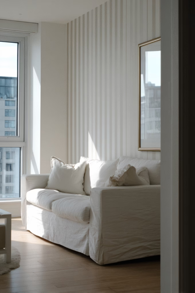
Minimalist wallpaper featuring thin vertical or horizontal lines, subtle stripes, or delicate geometric grids creates sophisticated simplicity perfect for contemporary living rooms.
This design aesthetic aligns with the broader minimalist movement that prioritizes quality over quantity and visual calm over busy stimulation. Minimalist patterns work through restraint—using simple repetition and neutral color palettes to create interest without demanding attention.
Vertical line patterns create the optical illusion of height, making standard 8-foot ceilings appear taller. According to basic design principles, vertical elements draw the eye upward, which is why interior designers often recommend vertical-patterned wallpaper for living rooms with lower ceilings or limited square footage.
Horizontal line patterns emphasize width, making narrow living rooms feel more spacious and balanced. Choose lines spaced 2-4 inches apart for subtle texture that reads almost as solid color from a distance but reveals its pattern upon closer inspection.
Color selection matters tremendously in minimalist patterns. Opt for tone-on-tone designs (cream lines on white, light gray on medium gray) for maximum subtlety, or choose gentle contrast (soft blue lines on white, charcoal on cream) for slightly more definition.
Minimalist linear wallpaper works beautifully in Scandinavian, Japanese-inspired, or contemporary spaces where clean lines and uncluttered aesthetics dominate. It provides just enough visual interest to prevent walls from feeling stark while maintaining the serene, peaceful atmosphere essential to minimalist design.
This wallpaper style pairs perfectly with statement furniture pieces, allowing a sculptural chair or unique coffee table to serve as the room’s focal point while the walls provide an elegant, understated backdrop.
Shop This Design: Ferm Living Wallpaper offers sophisticated minimalist patterns, or explore Wallpaper Direct Geometric Collection for budget-friendly linear designs.
6. Vintage Damask for Timeless Elegance
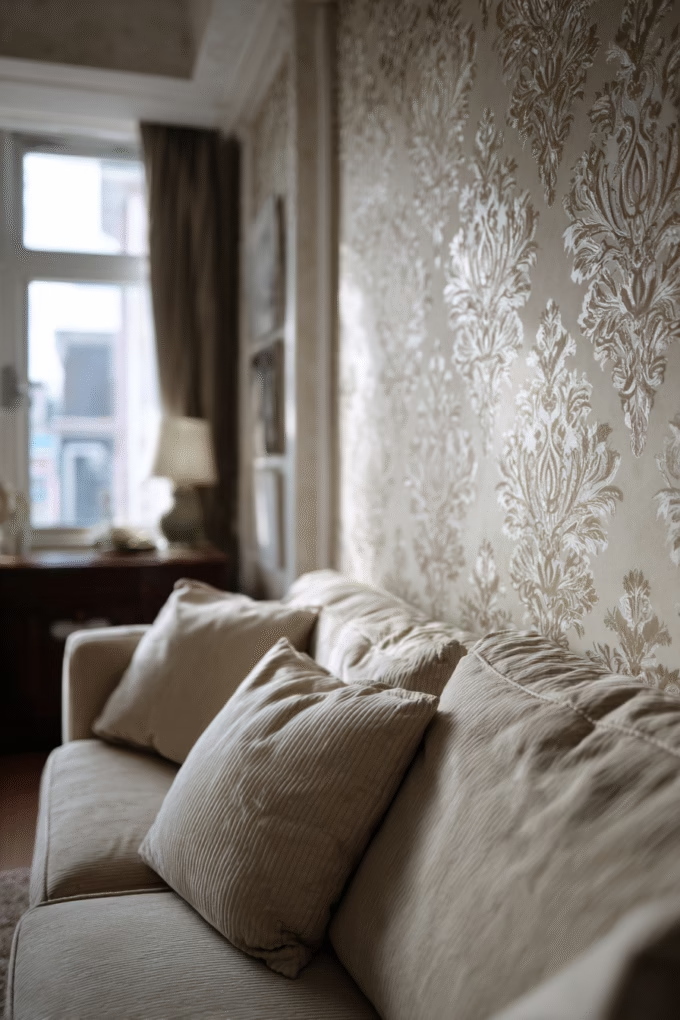
Damask wallpaper featuring ornate, symmetrical patterns with classical motifs brings traditional elegance and refined sophistication to living rooms.
Damask patterns originated in Damascus during the Middle Ages as luxurious woven fabrics, and this historical pedigree brings instant gravitas to contemporary interiors. According to Walls Republic’s 2025 trend analysis, damask wallpaper is experiencing a comeback, with the classic Victorian design mixing well with modern furniture and interiors, making it ideal for focal points in every space.
The beauty of damask lies in its subtle tone-on-tone approach—the pattern is typically rendered in the same color family as the background but with a raised or glossy finish that catches light differently. This creates visual interest that shifts throughout the day as natural light moves through your living room.
Damask wallpaper works on the principle of symmetry, which the human brain finds inherently pleasing and calming. The repetitive, balanced patterns create a sense of order and intentionality that elevates the perceived formality of a living room.
Choose cream or champagne damask on a slightly darker beige background for warm, traditional elegance that pairs beautifully with wood furniture and oil paintings. Opt for silver or pale gray damask on white backgrounds for a more contemporary interpretation that works in transitional spaces.
Interior designers recommend damask for formal living rooms used primarily for entertaining rather than family gathering spaces, as the refined pattern conveys a sense of occasion. However, modern interpretations featuring larger-scale damask motifs or unexpected color combinations (navy on cream, blush on gray) make this traditional pattern feel fresh and current.
Damask pairs beautifully with crown molding, wainscoting, and other architectural details common in period homes. In newer construction lacking architectural interest, damask wallpaper provides instant character and visual complexity.
Shop This Design: Farrow & Ball Wallpaper offers sophisticated damask designs, or try Laura Ashley’s Classic Collection for traditional patterns.
7. Abstract Watercolor for Artistic Expression
Abstract watercolor wallpaper featuring flowing, organic shapes in soft, blended colors creates an artistic, gallery-like atmosphere in living rooms.
This design trend reflects the growing interest in bringing original art into home spaces, even when budget or wall space doesn’t allow for large canvas pieces. Abstract watercolor wallpaper functions as affordable, large-scale artwork that transforms an entire wall into a creative statement.
The soft, flowing nature of watercolor patterns creates visual movement without harsh lines or geometric rigidity. This makes watercolor wallpaper particularly effective in living rooms where you want energy and interest but not the structured formality of geometric patterns or the traditional associations of florals.
According to color psychology principles, watercolor designs in cool tones (blues, greens, lavenders) promote relaxation and calm, making them ideal for living rooms serving as primary family gathering spaces. Warmer watercolor palettes (coral, peach, gold) create more energized, social atmospheres suitable for living rooms focused on entertaining.
Choose abstract watercolor designs with predominantly neutral backgrounds (white, cream, light gray) and splashes of color rather than fully saturated designs. This prevents visual overwhelm and ensures the wallpaper enhances rather than dominates your living room.
Watercolor wallpaper works beautifully in contemporary and eclectic spaces where artistic expression is valued. It pairs well with modern furniture featuring clean lines, as the soft, organic wallpaper pattern provides pleasant contrast to angular furniture shapes.
Interior designers often recommend watercolor wallpaper for living rooms lacking architectural interest, as the flowing patterns create focal points without requiring structural changes. This makes it particularly appealing for renters using peel-and-stick versions.
Shop This Design: Anthropologie Wallpaper features artistic designs with bohemian flair, or explore Wallsauce Abstract Collection for customizable watercolor patterns.
8. Luxe Metallic Finishes for Glamorous Shine

Metallic wallpaper featuring gold, silver, bronze, or copper finishes adds luminous sophistication and glamorous dimension to living rooms.
Metallic wallcoverings work by incorporating actual metallic inks or foils that reflect light differently than standard matte wallpapers. This creates dynamic visual interest that changes throughout the day as natural light moves through your space, and provides dramatic shimmer in evening hours when illuminated by lamps and overhead lighting.
According to Decorilla’s 2025 interior design trends analysis, warm metallics—particularly gold, bronze, and copper tones—continue to bring a touch of luxury to interiors, pairing beautifully with both neutral and bold color schemes.
The key to successfully incorporating metallic wallpaper is balancing shimmer with matte elements. Interior designers recommend using metallic wallpaper on a single accent wall rather than all four walls, which can feel overwhelming or even garish. This allows the metallic finish to serve as a jewelry-like accent that elevates the entire space without dominating it.
Choose metallic wallpapers with subtle patterns (geometric grids, delicate florals, abstract brush strokes) rather than solid metallic finishes, which can read as industrial or cold. The pattern provides visual interest while the metallic finish adds dimension and luxury.
Metallic wallpaper works particularly well in living rooms with limited natural light, as the reflective surface helps bounce available light around the space, making it feel brighter and more open. This makes it an excellent choice for basement living rooms or spaces with small windows.
Pair metallic wallpaper with rich, jewel-toned furniture (emerald velvet, sapphire blue) for a luxurious, opulent aesthetic, or balance it with neutral beiges and creams for a more subdued, sophisticated look.
Shop This Design: York Wallcoverings Metallics Collection offers classic metallic patterns, or try Divine Savages for bold, contemporary metallic designs.
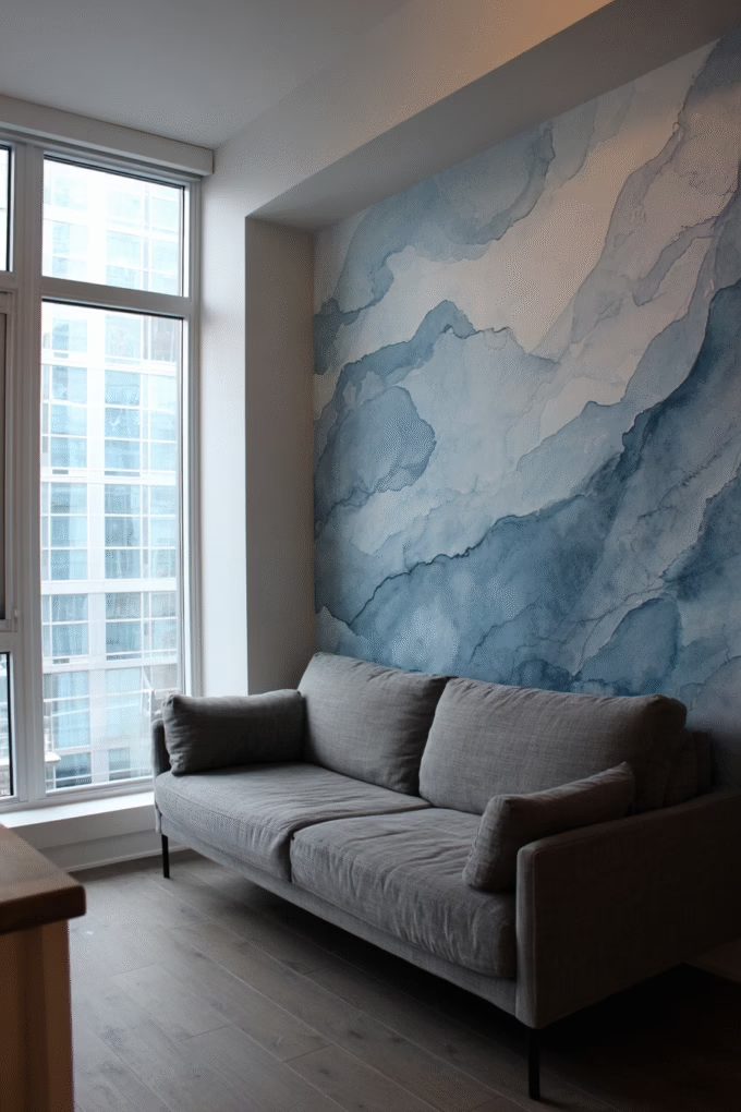
9. Scenic Landscape Murals for Escapism
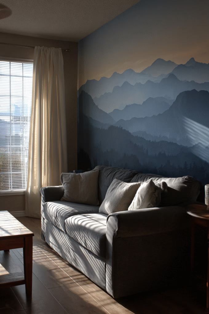
Scenic landscape wallpaper murals featuring mountains, forests, beaches, or countryside views create immersive, escapist atmospheres that transport living rooms to distant locations.
This design category taps into our fundamental human desire for connection with nature and exploration. According to principles of environmental psychology, views of natural landscapes—even representations on walls—can reduce stress and promote mental wellbeing by satisfying our innate need for prospect (ability to see into the distance) and refuge (sense of safety).
Landscape murals work best when scaled appropriately to your wall dimensions. Most reputable wallpaper companies offer custom sizing, allowing you to create a seamless, proportional scene rather than awkwardly cropped images. For standard 8-foot ceilings and 12-14 foot wide walls, choose horizons positioned at approximately eye level (5-6 feet high) to create the most natural, immersive effect.
Choose misty mountain scenes in blues and grays for calming, meditative atmospheres perfect for living rooms focused on relaxation. Opt for forest scenes with rich greens and earth tones for grounding, natural vibes. Beach or coastal landscapes in soft blues and sandy neutrals create breezy, vacation-like feelings.
Landscape murals work particularly well in living rooms lacking views—urban apartments, basement spaces, or rooms facing walls or fences. The mural provides a visual escape and sense of openness that windows typically offer.
Interior designers recommend treating landscape murals as the room’s sole focal point. Keep surrounding walls neutral and décor minimal to allow the scenic view to dominate. This prevents visual competition and maintains the immersive, transportive quality that makes landscape murals effective.
For living rooms with existing fireplaces or architectural features, place landscape murals on adjacent walls rather than directly behind these elements, which can create visual confusion about the room’s primary focus.
Shop This Design: Rebel Walls Nature Collection offers photorealistic landscape murals in various scales, or explore Murals Wallpaper for extensive scenic options.
10. Modern Palm and Tropical Prints for Laid-Back Luxury
Tropical wallpaper featuring palm fronds, monstera leaves, or banana leaves in fresh greens and whites creates a relaxed, resort-inspired atmosphere.
Tropical patterns remain consistently popular because they deliver instant vacation vibes and create the laid-back luxury aesthetic that appeals across demographic groups. Unlike busy, jungle-print wallpapers from past decades, contemporary tropical designs feature stylized, graphic interpretations of palm leaves with substantial negative space between elements.
The psychology behind tropical patterns is straightforward: these designs evoke memories and associations with relaxation, warmth, and escape from daily stresses. For living rooms serving as primary relaxation zones after long work days, tropical wallpaper reinforces the room’s purpose through visual cues.
Choose designs with deep green palm fronds on white or cream backgrounds for fresh, airy aesthetics that work in coastal, modern, or contemporary spaces. This color combination maximizes light reflection while maintaining visual interest through the bold leaf shapes.
For living rooms with abundant natural light, tropical wallpaper creates cheerful, energetic atmospheres. In spaces with limited windows, choose tropical designs with lighter backgrounds and more negative space to prevent the pattern from feeling heavy or dark.
According to design principles, tropical patterns work best when balanced with natural materials—rattan furniture, woven baskets, wood coffee tables—that reinforce the organic, nature-inspired aesthetic. Pair tropical wallpaper with white or neutral upholstery to keep the look fresh and prevent it from tipping into tiki-bar territory.
Interior designers recommend tropical wallpaper for living rooms in warm climates or spaces where you want to establish a year-round vacation mindset. It’s particularly effective in homes near beaches or in sun-belt regions where the tropical aesthetic feels authentic rather than affected.
Shop This Design: Graham & Brown Palm Collection features sophisticated tropical designs, or try Tempaper Tropics for removable peel-and-stick options perfect for renters.
11. Herringbone or Chevron Patterns for Dynamic Movement
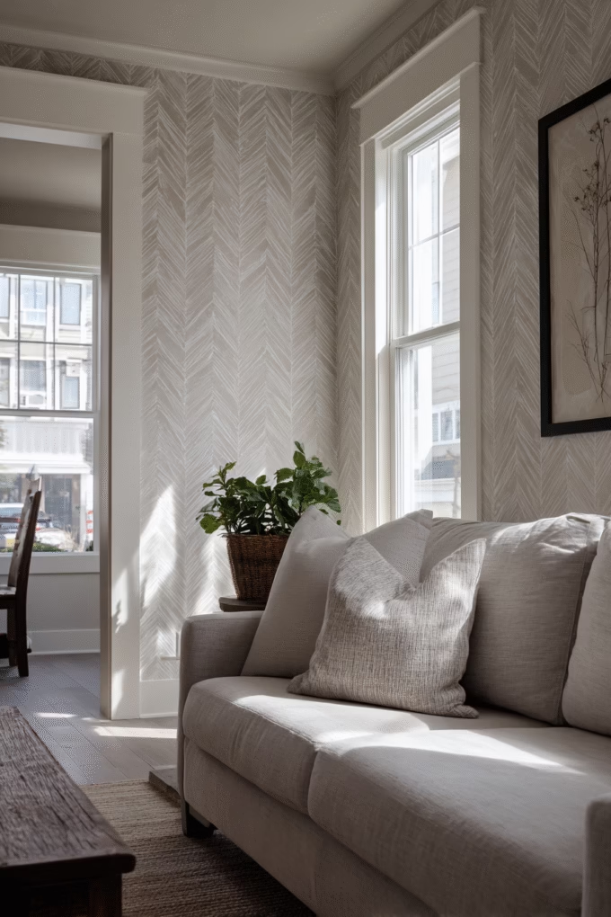
Herringbone or chevron-patterned wallpaper creates visual movement and sophisticated energy through angular, V-shaped patterns that guide the eye.
These classic patterns have architectural roots—herringbone originated in Roman road construction and has been used in wood flooring and tile for centuries. When translated to wallpaper, herringbone and chevron patterns bring that same sense of craftsmanship and intentional design to vertical surfaces.
The difference between these patterns matters: true herringbone features broken zigzags where the pattern shifts at each row, while chevron creates continuous V shapes. Herringbone reads as slightly more traditional and refined, while chevron feels more contemporary and bold.
According to basic design principles, diagonal lines create movement and energy, making herringbone and chevron effective choices for living rooms where you want visual dynamism without busy, chaotic patterns. The angular lines create direction and flow that keeps spaces feeling active rather than stagnant.
Choose herringbone or chevron in neutral two-tone combinations (gray and white, taupe and cream, black and white) for versatile sophistication that works with various furniture styles. These patterns provide strong visual interest without competing with colorful accessories or artwork.
Scale significantly impacts herringbone’s effectiveness. Large-scale patterns (V shapes spanning 12+ inches) create bold, modern statements suitable for spacious living rooms. Smaller-scale patterns (V shapes under 6 inches) read as textured neutrals from a distance, working better in compact spaces.
Interior designers often use herringbone wallpaper to add visual interest in living rooms with minimal architectural details. The pattern creates the illusion of structural complexity without requiring molding or wainscoting installation.
Shop This Design: Serena & Lily Wallpaper offers coastal-inspired herringbone, or explore Cole & Son Geometric Collection for classic European patterns.
12. Art Deco Geometric for Vintage Glamour

Art Deco wallpaper featuring geometric patterns, sunburst motifs, or stylized fan shapes brings 1920s-1930s glamour and sophisticated vintage charm to living rooms.
Art Deco design emerged during the interwar period as a celebration of modernity, luxury, and geometric precision. These historical associations make Art Deco wallpaper particularly effective for creating living rooms that feel both glamorous and historically grounded.
The defining characteristics of Art Deco patterns include symmetry, geometric shapes (particularly circles, sunbursts, and fan shapes), metallic accents, and bold color contrasts. These elements combine to create patterns that feel both structured and celebratory—orderly yet exuberant.
Choose Art Deco wallpaper in classic color combinations: black and gold, navy and silver, or emerald and brass. These high-contrast pairings create the dramatic, opulent aesthetic that defines the Art Deco style.
Art Deco wallpaper works particularly well in living rooms with period architecture—homes built in the 1920s-1940s with original details like crown molding or ceiling medallions. However, it also creates striking contrast in ultra-modern spaces, where the vintage pattern provides unexpected personality against contemporary furniture.
Interior designers recommend pairing Art Deco wallpaper with velvet upholstery, mirrored surfaces, and glass accents to reinforce the glamorous, luxe aesthetic. This creates cohesive spaces that feel intentionally curated rather than randomly assembled.
Shop This Design: Bradbury & Bradbury Art Deco Collection offers historically accurate designs, or try Farrow & Ball’s Geometric Patterns for more subtle Art Deco interpretations.
13. Neutral Linen Texture for Quiet Luxury
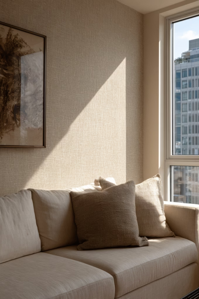
Linen-textured wallpaper in neutral tones creates sophisticated, understated elegance through subtle fabric-like texture and natural color variations.
This design trend aligns perfectly with the “quiet luxury” movement that has dominated high-end interior design, where refined quality and subtle sophistication trump obvious logos or flashy patterns. Linen-textured wallpaper embodies this aesthetic through its emphasis on material quality, natural variations, and tactile appeal rather than bold visual statements.
Linen wallpaper works by replicating the irregular weave and slubby texture of natural linen fabric. Unlike grasscloth, which features more pronounced horizontal or vertical lines, linen wallpaper presents a more irregular, fabric-like texture that reads as soft and inviting rather than structured.
According to textile experts, the appeal of linen lies in its imperfections—the irregular threads, color variations, and organic texture signal natural materials and traditional craftsmanship. When these qualities are translated to wallpaper, they bring that same sense of authenticity and quality to wall surfaces.
Choose warm neutrals—oatmeal, flax, natural linen, warm gray—for cozy, inviting atmospheres. Opt for cooler tones—silver, dove gray, cool beige—for more contemporary, minimalist spaces. The neutral palette ensures linen wallpaper works with virtually any furniture style or color scheme.
Linen-textured wallpaper is particularly effective in living rooms where you want sophisticated visual interest without competing patterns or colors. It provides just enough texture to prevent walls from feeling flat while maintaining the calm, serene atmosphere essential to relaxation-focused spaces.
Interior designers recommend linen wallpaper for all four walls rather than single accent walls, as the enveloping effect creates the cozy, wrapped feeling that makes this aesthetic successful. The uniform texture throughout the room establishes a cohesive, high-end appearance.
Shop This Design: Phillip Jeffries Linen Collection offers premium fabric-backed linen wallcoverings, or explore Magnolia Home by Joanna Gaines for farmhouse-inspired linen textures.
14. Terracotta and Rust Earth Tones for Warmth

Earth-toned wallpaper in terracotta, rust, burnt orange, or clay colors creates warm, grounding atmospheres inspired by Mediterranean and Southwestern aesthetics.
According to Pantone’s 2025 Color of the Year selection—Mocha Mousse—and broader color trend forecasts as noted in Wallpaper Direct’s 2025 trends forecast, warm earth tones continue their dominance as homeowners seek comfort and connection to natural landscapes. Terracotta and rust tones specifically evoke sun-baked clay, desert vistas, and Tuscan hillsides, bringing those warm, organic associations into living rooms.
These colors work psychologically by creating feelings of security, warmth, and groundedness. Unlike cooler blues or grays that can feel distant or intellectual, warm earth tones promote comfort and approachability—qualities that make living rooms feel welcoming to family and guests alike.
Choose terracotta geometric patterns for contemporary spaces, abstract brush strokes for artistic aesthetics, or subtle textured designs for more understated applications. The warm color provides the impact, so patterns can remain relatively simple.
Earth-toned wallpaper works particularly well in living rooms with abundant natural light, where the warm colors create glowing, sun-filled atmospheres. In spaces with limited windows, earth tones can feel heavy, so opt for lighter terracotta shades (salmon, peachy-terracotta) rather than deep rust or burnt orange.
According to interior design principles, earth tones pair beautifully with natural materials—raw wood, leather, woven textiles, ceramic—that reinforce the organic, grounded aesthetic. This creates layered, textured spaces that feel collected and authentic rather than styled or artificial.
Interior designers recommend terracotta wallpaper for living rooms in Southwestern, Mediterranean, or modern bohemian homes where the warm earth tone aesthetic feels authentic. It’s particularly effective in spaces with tile flooring, exposed wood beams, or other architectural elements that support the earthy vibe.
Shop This Design: Graham & Brown Terracotta Collection features contemporary earth-toned patterns, or try Spoonflower Custom Prints for unique, independent designer terracotta wallpapers.
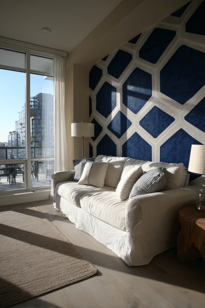
15. Navy Blue with Gold Accents for Sophisticated Drama

Navy blue wallpaper with gold metallic accents or patterns creates rich, jewel-toned sophistication and classic elegance in living rooms.
This color combination has historical roots in royal and nautical design, where navy represented authority and stability while gold signified wealth and prestige. These associations make navy and gold wallpaper particularly effective for creating living rooms that feel refined and intentional.
Navy blue works as a nearly-neutral dark color that provides drama without the starkness of black or the weight of dark brown. It pairs beautifully with virtually any wood tone, metal finish, or accent color, making it remarkably versatile despite its bold saturation.
According to color psychology principles, blue is the most universally appreciated color across cultures and demographics, with darker blues specifically associated with trust, stability, and intelligence. In living room contexts, navy creates sophisticated backdrops that feel both dramatic and approachable.
Choose wallpaper patterns where gold appears as delicate accents—thin lines, small geometric shapes, or metallic detailing—rather than large gold blocks. This maintains the navy’s dominance while the gold provides luminous highlights that catch light throughout the day.
Navy and gold wallpaper works particularly well in living rooms serving formal entertaining functions, where the refined color combination establishes an elegant tone. It’s also effective in living rooms lacking architectural interest, as the rich colors provide instant depth and character.
Interior designers recommend pairing navy wallpaper with brass or gold light fixtures, warm wood furniture, and cream or white upholstery to create balanced, layered schemes. The contrast between dark walls and light furniture prevents spaces from feeling too heavy or enclosed.
For living rooms with limited natural light, use navy wallpaper on a single accent wall rather than all four walls. This provides drama without making the space feel cave-like.
Shop This Design: Schumacher Designer Collection offers luxury navy and gold patterns, or explore Tempaper Navy Collection for removable options.
16. Japanese-Inspired Minimalist Patterns for Zen Calm

Japanese-inspired wallpaper featuring delicate cherry blossoms, bamboo motifs, or abstract brushstroke patterns creates serene, meditative living room atmospheres.
This design aesthetic draws from centuries-old Japanese principles emphasizing simplicity, natural materials, and mindful living. According to the concept of “ma” in Japanese design—the importance of negative space—these patterns work through restraint rather than abundance, using deliberate empty spaces to create breathing room and visual calm.
Japanese-inspired patterns typically feature soft, muted color palettes (pale pink, sage green, soft gray, cream) with delicate, nature-based motifs rendered in simple, stylized forms. This creates wallpaper that provides visual interest without demanding attention or creating overstimulation.
The psychology behind Japanese-inspired design centers on promoting mindfulness and reducing visual clutter. In living rooms serving as retreats from busy daily life, these patterns support relaxation through their inherent calmness and connection to natural elements.
Choose cherry blossom patterns for gentle, romantic aesthetics with soft pink accents against white or cream backgrounds. Opt for bamboo motifs in sage green and tan for more structured, masculine interpretations. Abstract brushstroke patterns in gray and white create the most minimalist, contemporary version of Japanese-inspired design.
Japanese-inspired wallpaper works particularly well in living rooms embracing minimalist or Japandi (Japanese-Scandinavian fusion) aesthetics. It pairs beautifully with low-profile furniture, natural wood tones, and organic textiles like linen and cotton.
Interior designers recommend keeping décor minimal when using Japanese-inspired wallpaper, as the aesthetic relies on emptiness and restraint to create its calming effect. Remove unnecessary accessories and let the wallpaper’s delicate beauty shine without competition.
Shop This Design: Milton & King Wallpaper features contemporary Japanese-inspired designs, or try Farrow & Ball for more traditional interpretations.
17. Black and White Contrast for Bold Graphic Impact

Black and white wallpaper featuring high-contrast patterns creates bold, graphic sophistication and timeless elegance in living rooms.
This achromatic color combination works through maximum contrast—the complete absence of color focuses attention entirely on pattern, shape, and form. According to basic design principles, high contrast creates visual clarity and impact that moderate contrast cannot achieve, making black and white wallpaper particularly effective for statement-making spaces.
Black and white patterns have remained consistently popular across decades because they transcend trend cycles. Unlike specific color palettes that feel dated as trends shift, black and white maintains its sophistication indefinitely, making it a wise choice for homeowners seeking longevity in their design investments.
Choose large-scale geometric patterns for bold, modern statements, delicate florals for softer, more traditional interpretations, or abstract organic shapes for contemporary artistic vibes. The black and white palette provides the drama, so pattern selection determines the overall aesthetic direction.
Black and white wallpaper works particularly well in living rooms where you want flexibility with accent colors. Since the wallpaper contains no color, you can easily change throw pillows, artwork, and accessories in any hue without clashing. This makes it ideal for people who enjoy updating their décor seasonally or following color trends.
According to interior designers, black and white wallpaper creates the most successful results when balanced with warm, natural elements—wood furniture, woven textures, live plants—that prevent spaces from feeling too stark or cold. This combination of graphic contrast and organic warmth creates sophisticated yet approachable living rooms.
For living rooms with abundant natural light, black and white wallpaper creates dynamic spaces where the pattern appears crisp and clear. In darker spaces, choose patterns with more white than black to maintain brightness.
Shop This Design: Cole & Son Geometric Collection offers sophisticated black and white patterns, or explore Graham & Brown Mono Collection for contemporary graphic designs.
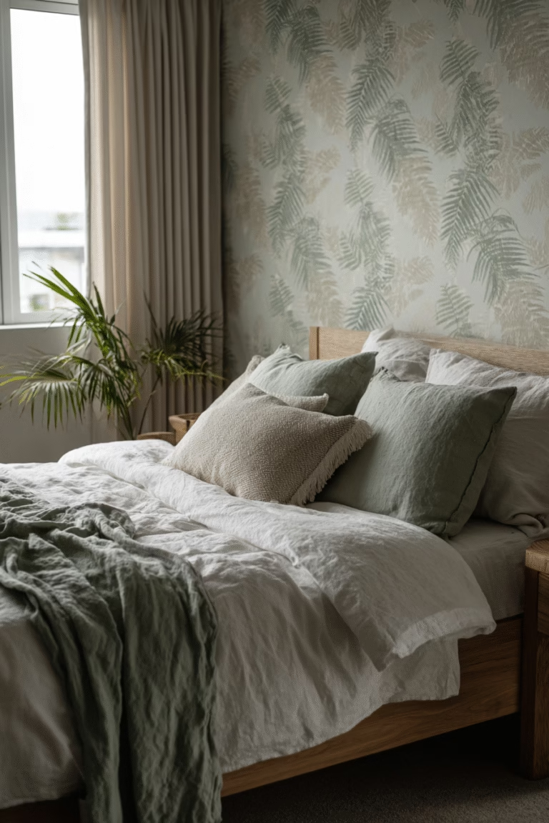
18. Sage Green Botanical for Calming Nature Connection
Sage green wallpaper featuring botanical motifs creates calming, nature-inspired living rooms with soft, muted sophistication.
Sage green has emerged as one of the most popular colors in interior design because it occupies the perfect middle ground between gray’s neutrality and green’s connection to nature. According to color psychology research, green is proven to be the most restful color for human eyes, making sage green wallpaper particularly effective in living rooms focused on relaxation.
The muted, grayish quality of sage distinguishes it from brighter kelly or lime greens, creating sophisticated rather than energetic or juvenile aesthetics. This makes sage green appropriate for adult living spaces where you want natural color without boldness.
Choose botanical patterns featuring leaves, ferns, or delicate stems in varying shades of sage, olive, and cream for layered, dimensional effects. The tone-on-tone approach prevents patterns from feeling too busy while maintaining visual interest through subtle color variations.
Sage green wallpaper works particularly well in living rooms with natural light, where the color appears fresh and nature-inspired. In spaces with limited windows or north-facing exposure, sage can lean gray rather than green, so test samples in your actual lighting conditions before committing.
According to environmental psychology principles, green promotes feelings of balance, harmony, and renewal—associations that make sage green wallpaper effective for creating living rooms that feel like personal sanctuaries. Pair sage walls with natural materials, organic shapes, and soft textures to reinforce the calming, nature-focused aesthetic.
Interior designers recommend sage green for living rooms in traditional, farmhouse, or transitional homes where the color’s softness complements rather than competes with existing architectural details. It’s particularly effective in homes with white trim and natural wood floors, where sage provides color without overwhelming.
Shop This Design: Magnolia Home Sage Collection features farmhouse-inspired sage patterns by Joanna Gaines, or try Graham & Brown Green Botanicals for more contemporary sage designs.
19. Brick or Stone Effect for Industrial Texture

Brick or stone-effect wallpaper replicating exposed brick, weathered stone, or concrete textures brings industrial edge and architectural character to living rooms.
This design trend reflects the ongoing popularity of industrial and loft aesthetics that celebrate raw, unfinished materials traditionally hidden behind drywall. Exposed brick wallpaper allows homeowners to achieve the industrial look without structural changes or the maintenance challenges of actual exposed masonry.
Brick-effect wallpaper works on multiple levels: it provides three-dimensional texture through embossed or printed shadows, creates visual warmth through rusty reds and orangy-browns, and suggests historical authenticity even in new construction. These combined effects make brick wallpaper particularly effective for adding instant character to living rooms lacking architectural interest.
Choose white-painted brick effects for brighter, more Scandinavian-inspired industrial looks that feel fresh and modern. Opt for traditional red brick with visible mortar lines for authentic loft aesthetics. Select gray stone or concrete effects for more contemporary, minimalist industrial spaces.
According to interior design principles, industrial aesthetics work best when balanced with softer elements—upholstered furniture, woven textures, greenery—that prevent spaces from feeling cold or harsh. This combination of rough and refined creates the layered, collected aesthetic that makes industrial design appealing.
Brick wallpaper works particularly well on single accent walls rather than all four walls, which can feel overwhelming or cave-like. Place brick-effect wallpaper behind sofas, televisions, or in dining areas within open-concept living spaces to create visual zoning without physical barriers.
Interior designers recommend brick wallpaper for urban lofts, converted industrial spaces, or modern farmhouse homes where the industrial aesthetic feels authentic. It’s less successful in traditional homes with formal architectural details, where the rough texture creates stylistic dissonance.
Shop This Design: A-Street Prints Brick Collection offers realistic brick effects in various colors, or try Walls Republic Concrete Collection for modern industrial textures.
20. Blush Pink Subtle Patterns for Soft Romance

Blush pink wallpaper with delicate patterns creates soft, romantic living rooms with gentle femininity and warm, welcoming aesthetics.
Blush pink occupies a unique position in color theory—it reads as a warm neutral rather than a bold color statement, making it far more versatile than true hot pink or bubblegum shades. According to color psychology, pink promotes feelings of calm, comfort, and nurturing, which translates beautifully to living room environments focused on family connection and relaxation.
The key to successfully incorporating blush pink wallpaper in adult living spaces lies in pattern selection and surrounding elements. Choose subtle patterns—delicate florals, fine geometric grids, abstract watercolor washes—rather than large-scale or busy designs. This prevents the pink from reading as juvenile or overly sweet.
Blush pink works particularly well when balanced with contrasting elements that add sophistication: black accents, brass fixtures, rich wood tones, or gray upholstery. These pairings prevent the pink from feeling one-note while allowing its warmth and softness to shine.
Blush pink wallpaper works beautifully in living rooms with northern exposure or limited natural light, where the warm undertones counteract the potential coldness of indirect light. It’s particularly effective in creating cozy, intimate atmospheres for evening entertaining or family relaxation.
Interior designers recommend blush pink for living rooms in transitional, modern, or eclectic homes where the soft color adds warmth without heavy traditional associations. Pair with velvet upholstery, marble accessories, and mixed metallics for sophisticated results.
Shop This Design: Anthropologie Pink Collection features romantic blush patterns, or try Wallpaper Direct Blush Designs for subtle contemporary pink wallpapers.
Choosing the Right Wallpaper for Your Living Room: Expert Guidance
Now that you’ve explored 20 stunning wallpaper designs, let’s discuss how to select the perfect option for your specific living room.
Consider Your Room’s Natural Light
Natural light dramatically impacts how wallpaper appears. Living rooms with south-facing windows and abundant sunlight can handle darker, bolder patterns without feeling closed-in. According to basic lighting design principles, natural light amplifies colors and reveals pattern details, making richly colored wallpapers appear vibrant and dynamic.
Conversely, living rooms with limited windows or north-facing exposure benefit from lighter wallpapers with reflective qualities. Metallics, light neutrals, and wallpapers with substantial white or cream backgrounds help maximize available light, preventing spaces from feeling dim or cave-like.
Match Wallpaper to Your Living Room’s Function
Different living rooms serve different purposes, and your wallpaper selection should support how you actually use the space. For formal living rooms used primarily for entertaining guests, sophisticated patterns like damask, Art Deco, or moody florals establish elegant atmospheres appropriate for social occasions.
For family living rooms serving as daily gathering spaces, choose patterns that won’t overwhelm during extended time spent in the room. Textured neutrals, subtle linear patterns, or nature-inspired designs in soft colors create comfortable environments for various activities—watching television, reading, conversation, or children’s play.
Balance Pattern with Your Existing Décor
According to the fundamental design principle of visual weight, your living room should contain a balanced mix of pattern, solid colors, and negative space. If your furniture, rugs, or curtains already feature substantial pattern, choose wallpaper with minimal pattern or subtle texture to prevent visual overwhelm.
Conversely, if your living room contains mostly solid-colored furniture and minimal pattern, wallpaper provides the perfect opportunity to introduce visual interest and personality through bold designs.
Consider the Size of Your Living Room
Room proportions significantly impact wallpaper effectiveness. In compact living rooms (under 200 square feet), large-scale patterns can overwhelm, while very small patterns may read as busy texture without clear design. Choose medium-scale patterns where the repeat is visible and appreciable but not dominating.
In spacious living rooms (300+ square feet), larger patterns work beautifully, creating visual interest across expansive walls. Murals and scenic wallpapers particularly excel in generous spaces where viewers have distance to appreciate the full design.
Vertical patterns make rooms with standard 8-foot ceilings feel taller by drawing the eye upward. Horizontal patterns emphasize width, making narrow living rooms feel more balanced and proportional.
Installation Considerations
Modern wallpaper comes in several installation types, each with distinct advantages. According to Houzz’s Fall 2025 Design Trends Report, wallpaper is experiencing a major revival and “showing up frequently on ceilings, along with other design treatments like bold paint, beams and coffers to add character and highlight architectural details.”
Peel-and-stick removable wallpaper uses pressure-sensitive adhesive backing, making it perfect for renters or commitment-phobes. Installation requires no paste or special tools—simply peel off the backing and smooth onto clean walls. Removal leaves no residue when done correctly. The tradeoff: peel-and-stick typically costs more per square foot than traditional wallpaper and may have slightly less sophisticated patterns available.
Pre-pasted wallpaper requires activating the dried paste with water, then hanging strips onto walls. This traditional method offers wider design selection and generally lower costs than peel-and-stick. It requires more skill and experience for professional-looking results.
Unpasted wallpaper requires separate wallpaper paste application but provides the most professional, long-lasting results. This method works best with high-end wallpapers, textured wallcoverings like grasscloth, or custom murals.
Budget Planning
Wallpaper costs vary dramatically based on material, pattern complexity, and brand prestige. Budget accordingly:
Budget-Friendly ($1-3 per square foot): Mass-produced vinyl or paper wallpapers from home improvement retailers. Adequate quality for temporary installations or low-visibility spaces.
Mid-Range ($3-8 per square foot): Designer wallpapers from established brands, peel-and-stick removable options, quality vinyl or paper wallcoverings. Sweet spot for most homeowners balancing quality and cost.
High-End ($8-30+ per square foot): Luxury wallpapers featuring premium materials (silk, grasscloth, handprinted designs), custom murals, or prestigious designer collections. Investment pieces for forever homes or showcase spaces.
Calculate wallpaper needs using online calculators or this formula: (wall height × wall width) ÷ coverage per roll = rolls needed. Always order 10-15% extra to account for pattern matching and potential installation errors.
The Bottom Line
Wallpaper design in living rooms has evolved far beyond its grandmother’s fussy florals. Today’s options span from serene botanicals to bold geometrics, moody dramatics to subtle textures, offering something for every aesthetic preference and functional need.
The resurgence of wallpaper in 2025 reflects a broader shift toward bold, personalized design over the safe neutrals that dominated the previous decade. This transformation speaks to our collective desire for homes that express individual personality and provide emotional resonance rather than generic, resale-focused decoration.
Your living room wallpaper choice sets the tone for your entire home. Whether you choose calming sage botanicals, dramatic navy and gold, industrial brick effects, or romantic blush patterns, the right wallpaper transforms your living room from a generic space into a personal sanctuary that reflects who you are and how you want to feel in your home.
Order samples of your top choices to view in your actual space’s lighting before committing so that you can visualize the different wallpaper ideas in the room of choice. And remember—wallpaper isn’t permanent. Even traditional installations can be removed and updated as your tastes evolve.
Ready to transform your living room? Save this guide, order those samples, and prepare to fall in love with your main gathering space all over again.